


Coception Studio Nov 2021 – Mar 2023

Project
Coception Studio CXD is the business and product development system from Joy Machine. Utilising the power of Notion it provides a collaborative ideation framework for business owners and their team. This framework gives an overview effect of all customer touch points across the customer journey. While also establishing a comprehensive design language system and brand story in the age of Ai assisted story telling.
Role
Founder, Lead Designer and web developer.
Brief
The project was to transform the existing design workflow of Joy machine into a self help framework to assist client’s business development. This required Concise and effective story telling to communicate complex systems and processes.
Tech
Adobe Illustrator, Figma, Figma Jam WordPress, Notion, Chat GPT

Details
Like a ouroboros of infinite iterations, the process of creating Coception studio utilises its own framework for its development.
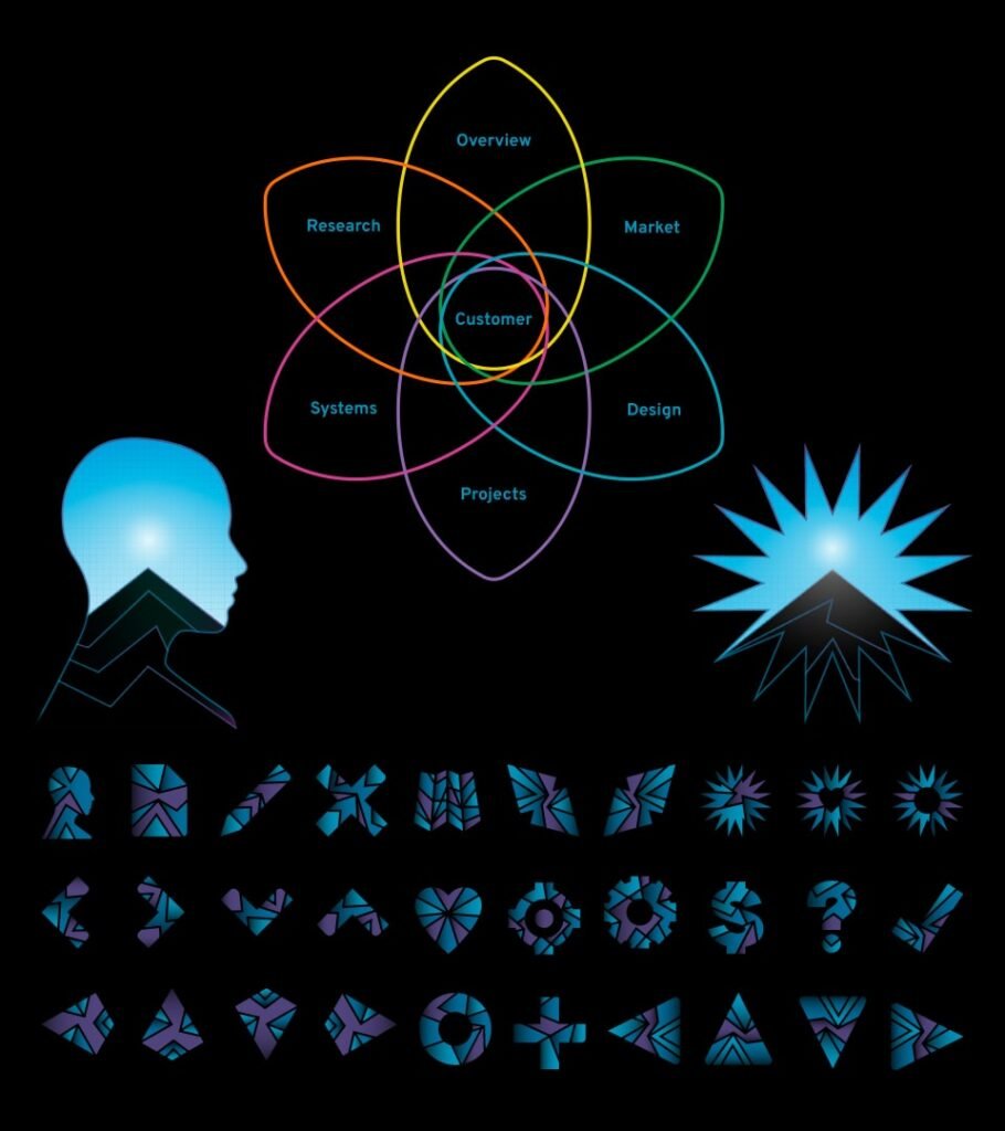
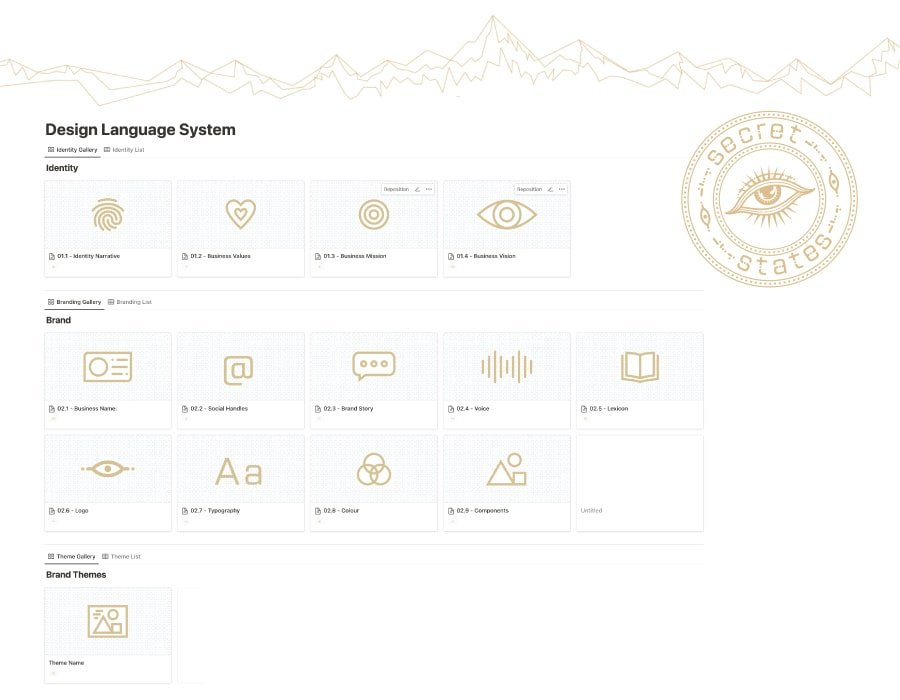
The initial structure was based on design language system framework integrated with a sprint project management system and customer profiles. Through many projects and iterations, the framework expanded by applying UX/UI principles to focus on the customer journey. Prioritising the customer journey and the customer touch point, provides a framework for marketers, product designers, developers and the business directors to collaborate with the storytelling of the higher level business ideation.


A well crafted design language was required with brand themes to support visual story telling required to communicate complex systems and processes. This was conceived in such a way to be in harmony with notion’s design and limited UI elements for both light and dark modes.
Being an flagship product of Joymachine, the branding of Coception needed to be succinct with the branding Joymachine while having its own unique stand alone identity.


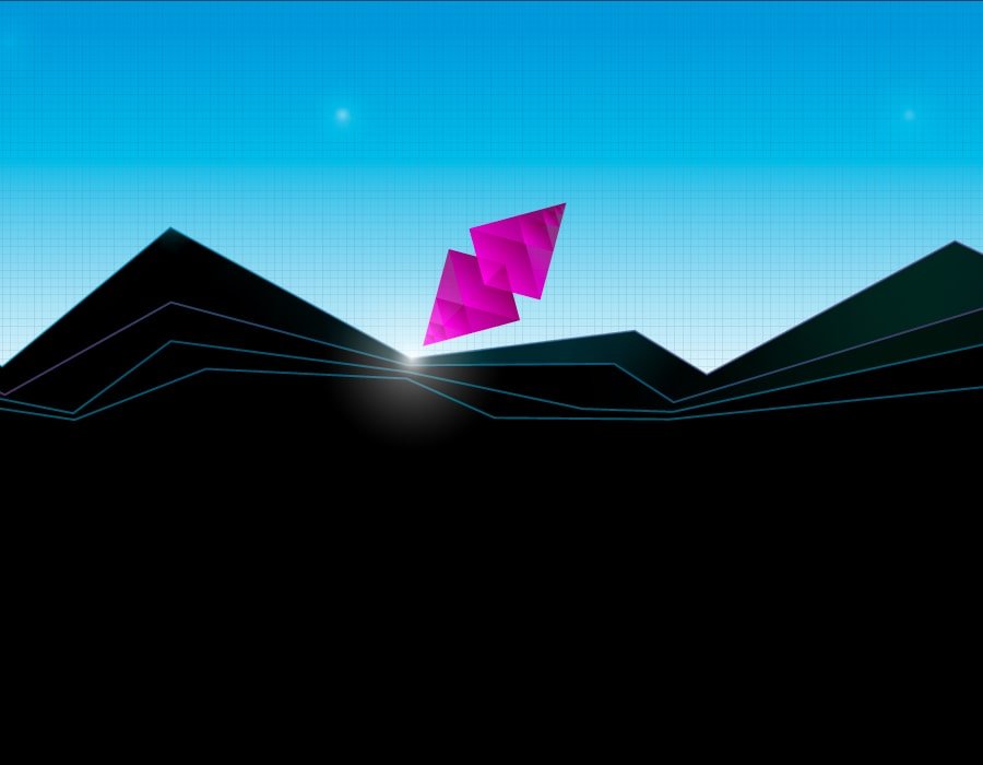


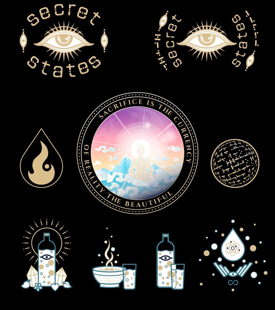
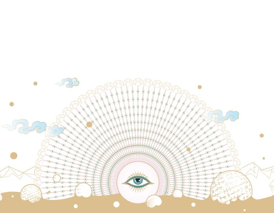
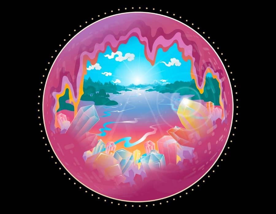
A brand theme – “crystal grid” was created for the framework notion pages, with headers icons and graphics to be used alongside the core design language. This theme was required to work within the limited UI elements and colour scheme of notion, for both dark and light mode.
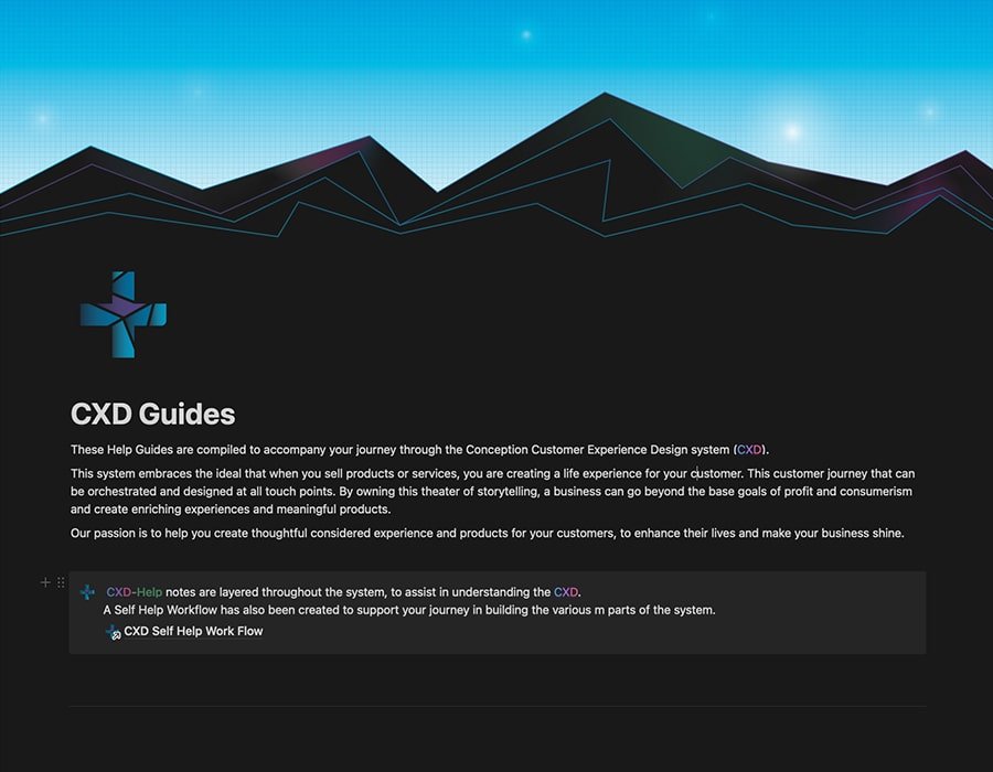
Extensive help guides and a self help work flow system was developed to assist the customer experience. This was created with the assistance of Ai assisted story telling and has Ai prompt guides to help business owners in their ideation process.


Reflection
To make the complexity of a complete design framework accessible and easy to understand is a hard challenge. Supportive graphics can help bridge this gap of understanding.
Secret States Sept 2020 – Feb 2023


Project
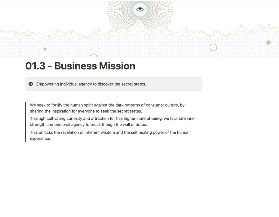
Secret States is drink and health company creating the world’s first water fasting tonics. These sugar and alcohol free drinks are crafted to support the water fasting experience and the health benefits of staying in ketosis.
Role
Product and Brand Designer, Project Manager and Web development.
Brief
Product and Brand design, developing a design language system, manufacturing pipelines, customer pathways for ecommerce site and marketing for social and email funnels.
Tech
XD, Illustrator, Photoshop, Notion, Figma, Indesign, WordPress, Woo Commerce, Klaviyo, Fluent CRM, PLANN, Discord.
Details
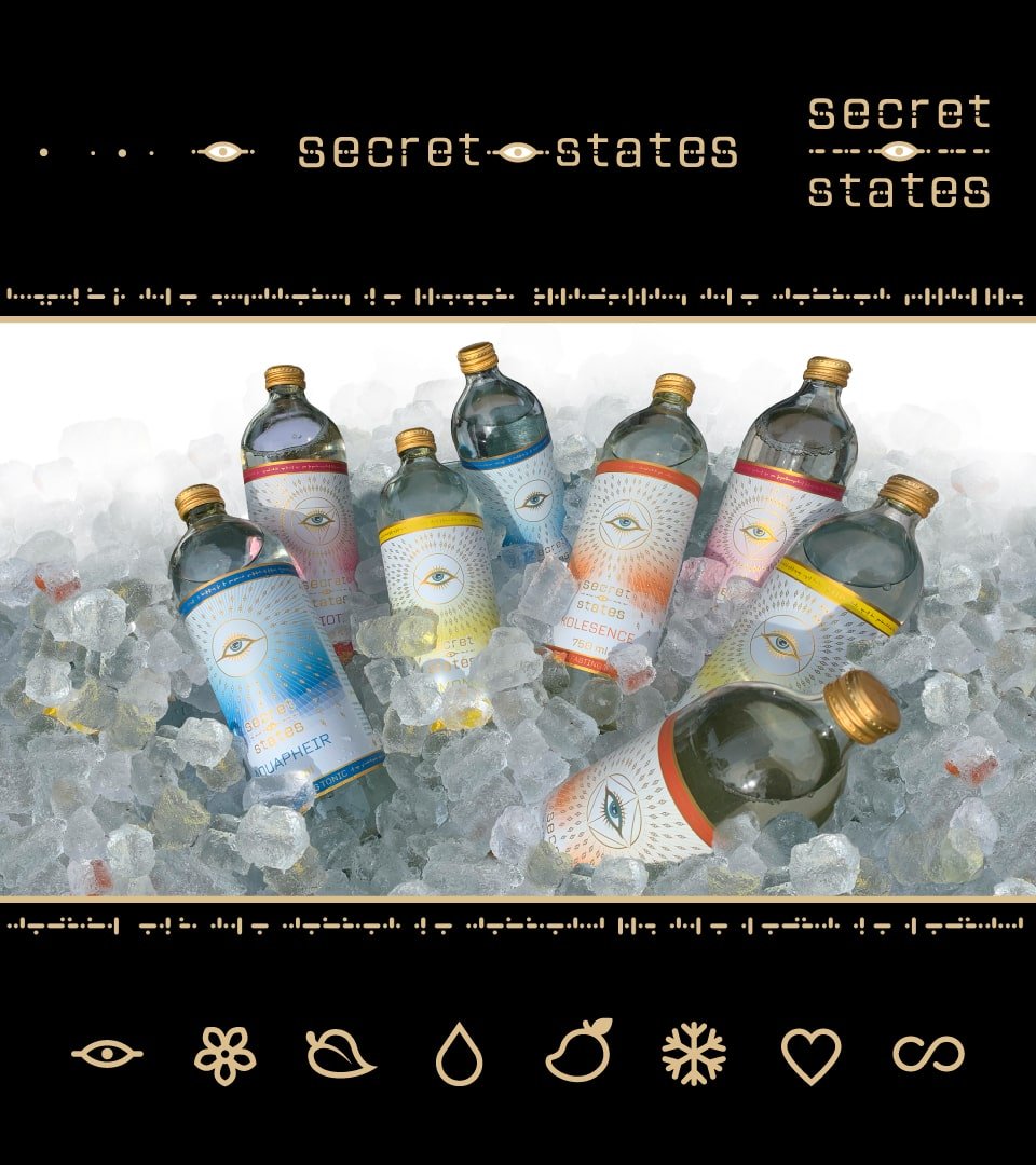
Working with the initial brand “Fasting Fluids” design iterations were developed that evolved into an elaborate “Secret States” design language. This was systematized using the Coception Studio CXD framework giving a macroscopic view of the customer journey and focus upon the higher aspects of the business identity. Extensive product design and development was required to pursue a new product category.
Packaging, distribution and business systems were design to integrate into a automated ecommerce website, built upon woo commerce platform.
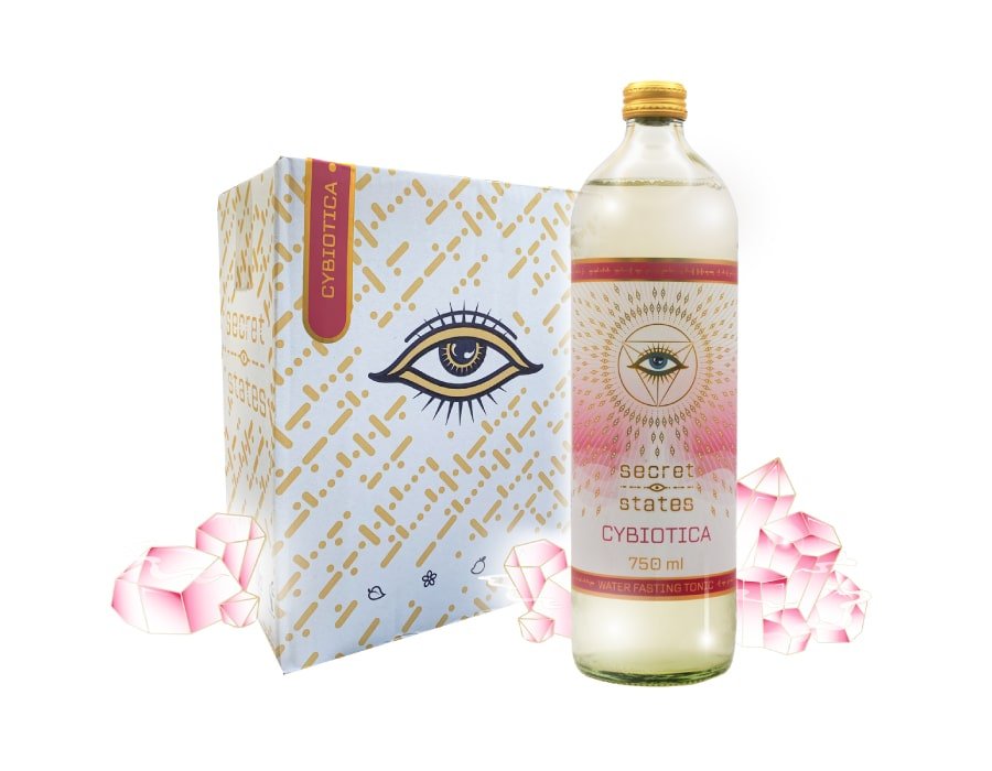
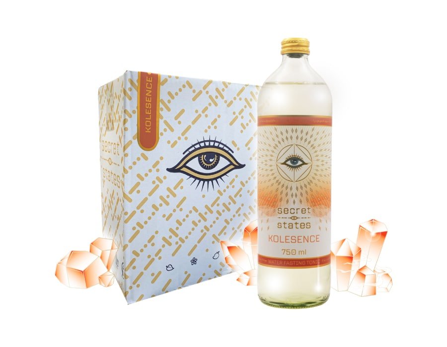
The branding process followed the Coception Studio CXD framework, creating a living design language system, with custom fonts, bespoke icons, graphics and brand themes that were envisaged alongside the development of product label designs.


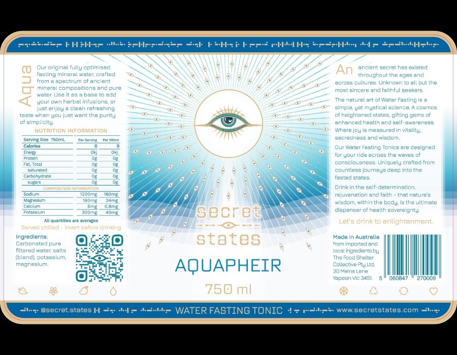
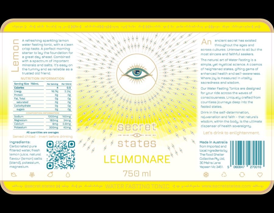
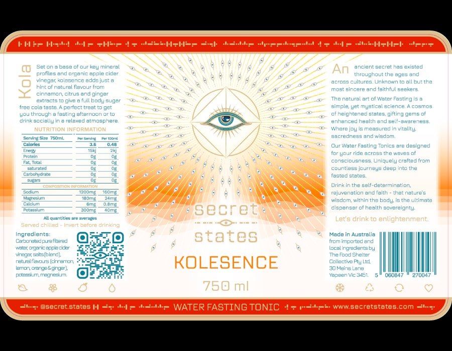
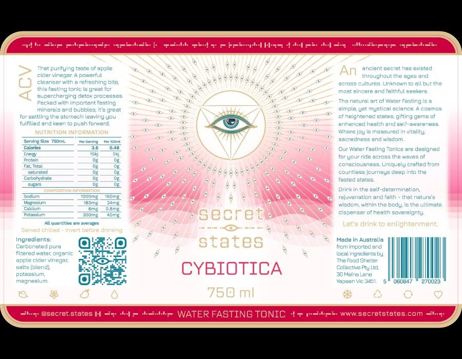
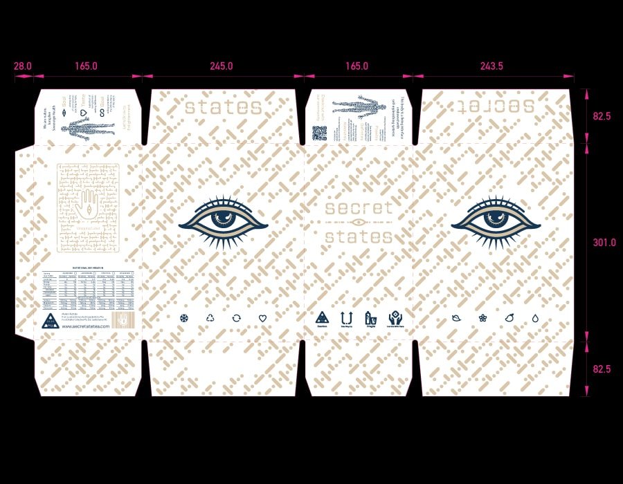
Utilsing the rich branding and visual themes Lables design for Premium Water Fasting Tonics and shipping carton were developed full of rich story telling.
Custom fonts and extensive graphics were created for the website and marketing collateral.


A quiver of brand themes were used to give direction to customer illustrations for the online store, social media and marketing collateral.
Reflection
Working with a business committed to brand excellence is a complete pleasure. Creating a business in white space brings the necessity to focus on the higher aspects of the business narrative.
In the age of AI assisted story telling defining the Brand persona, with complex voice, tone and moods can help create prompts for quick scaffolding for marketing narratives.
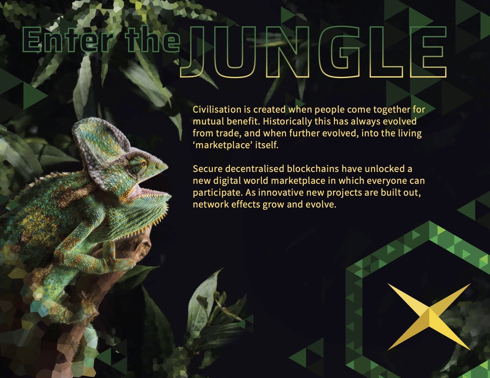
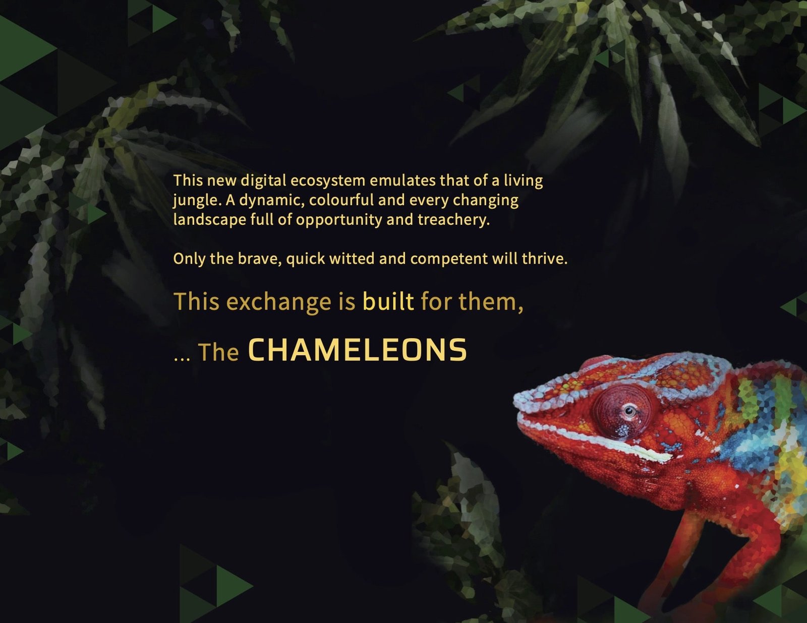
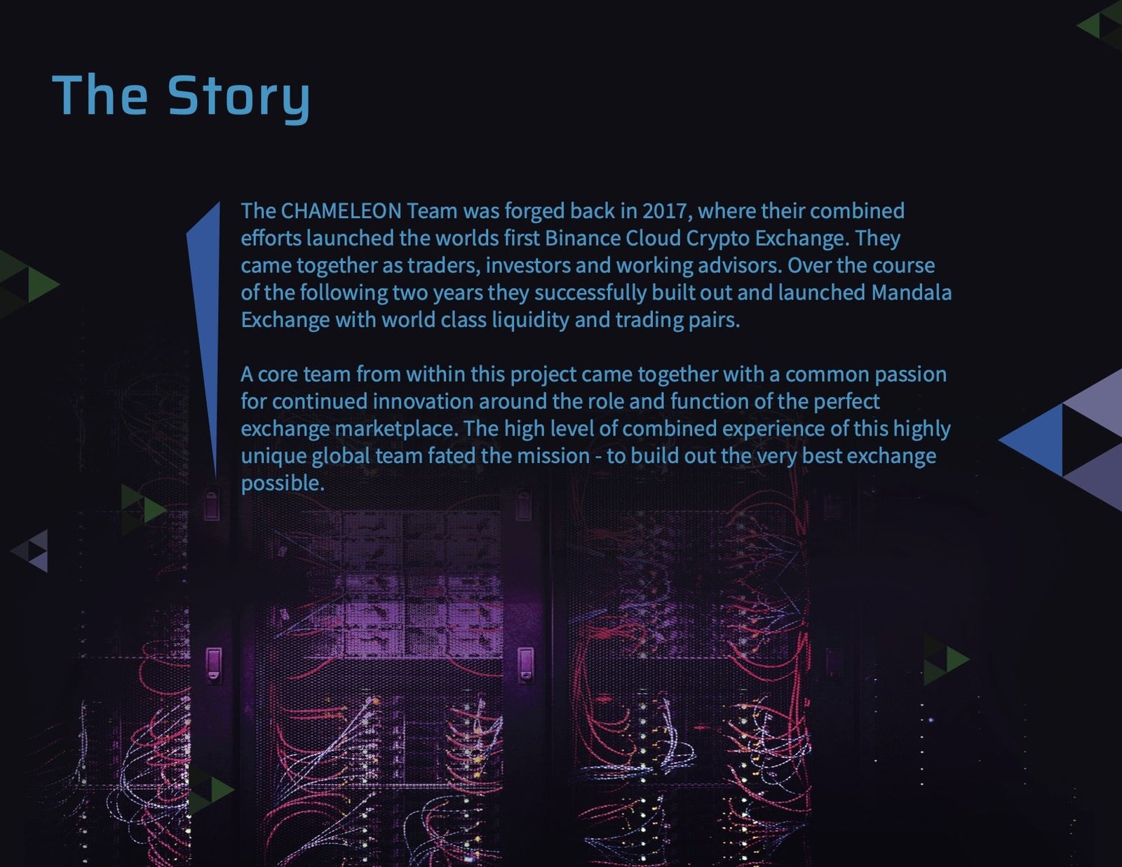
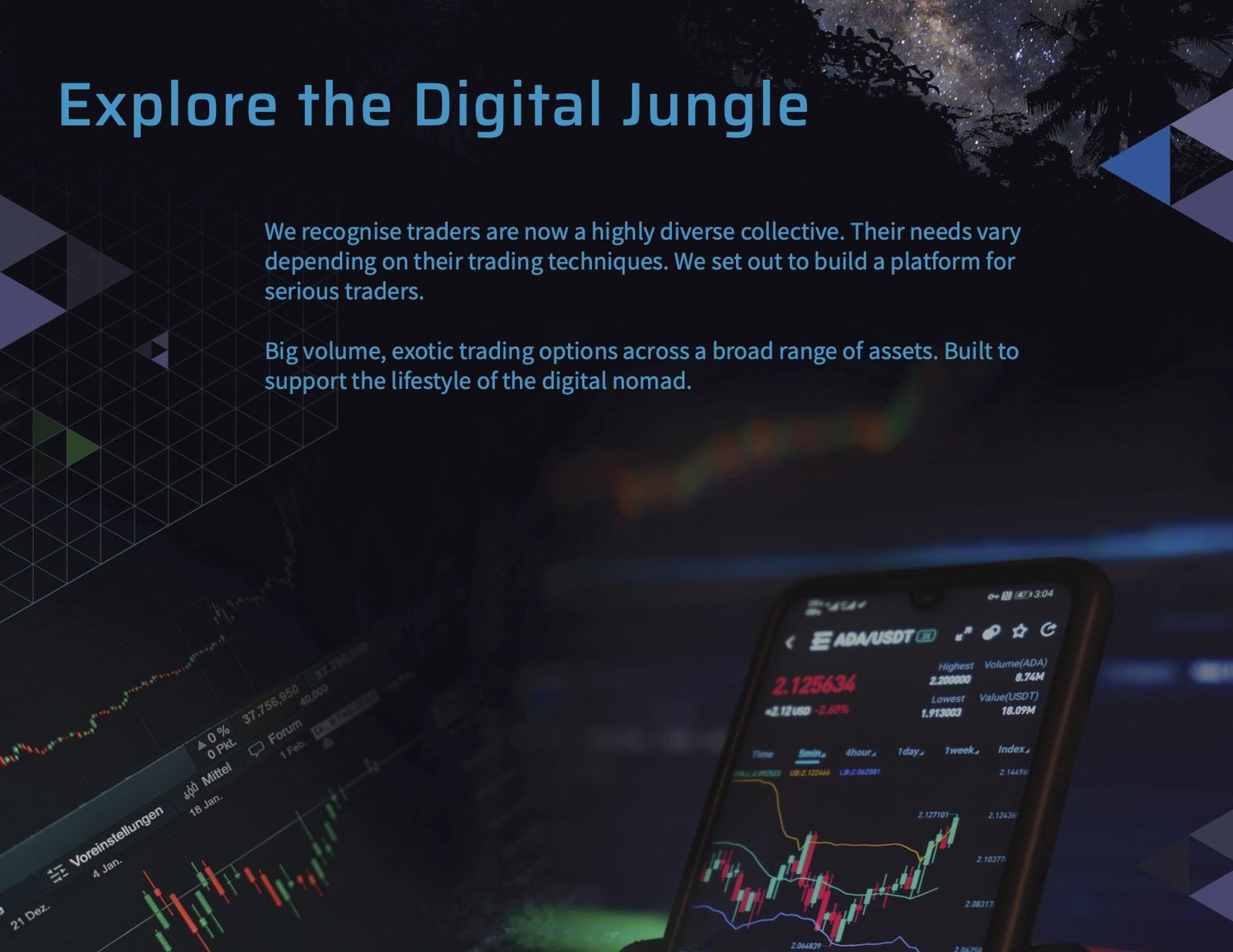
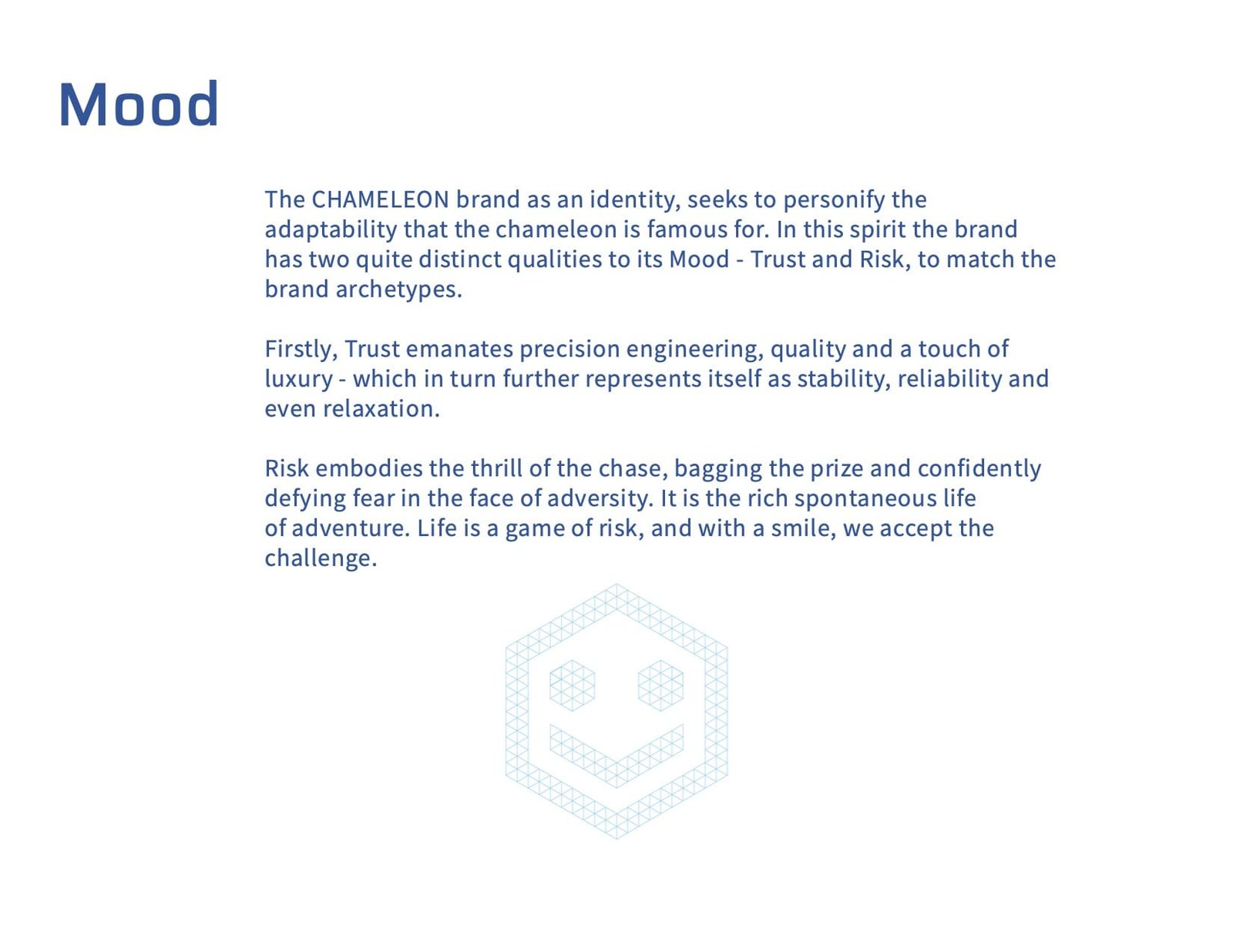
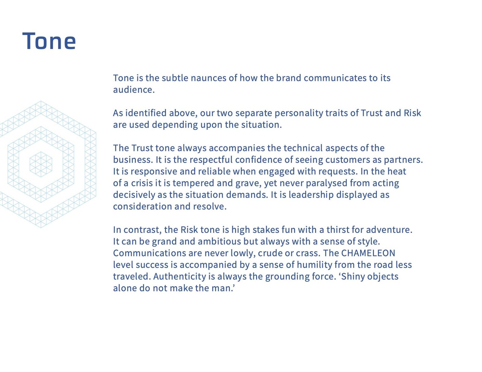
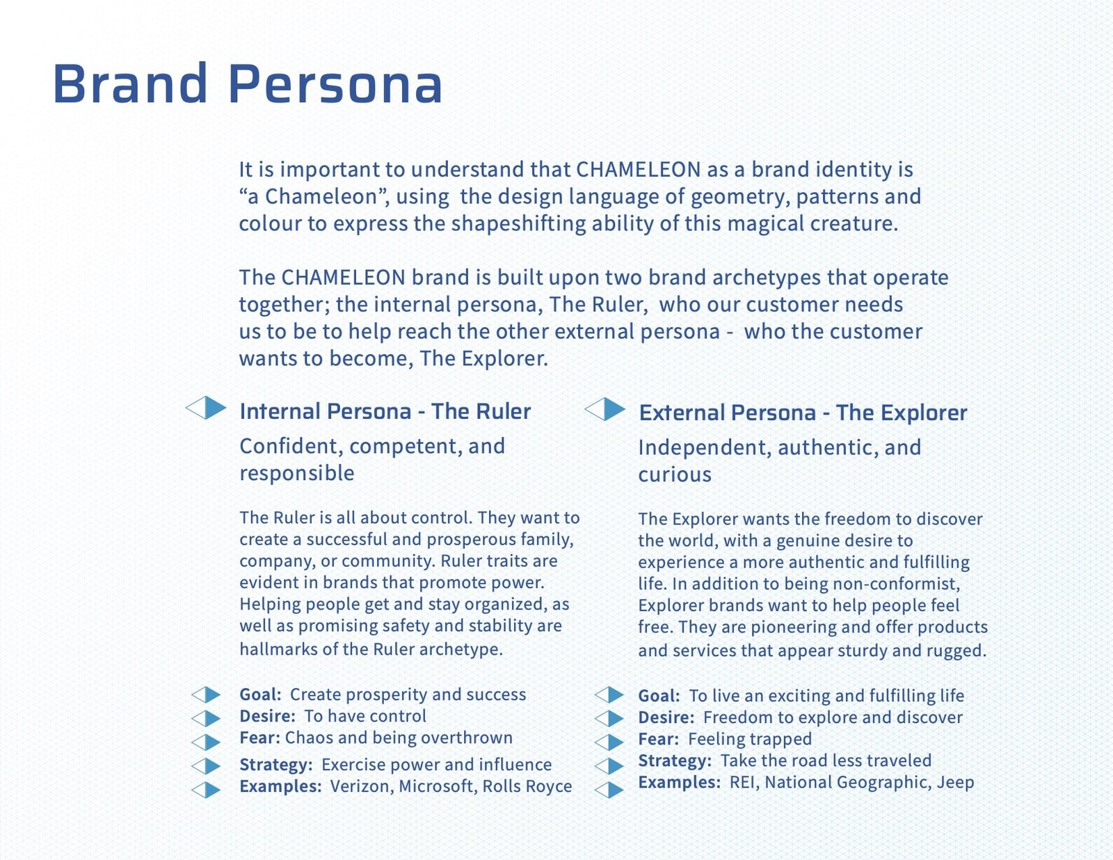
Chameleon Sept 2020 – Jun 2022
Project
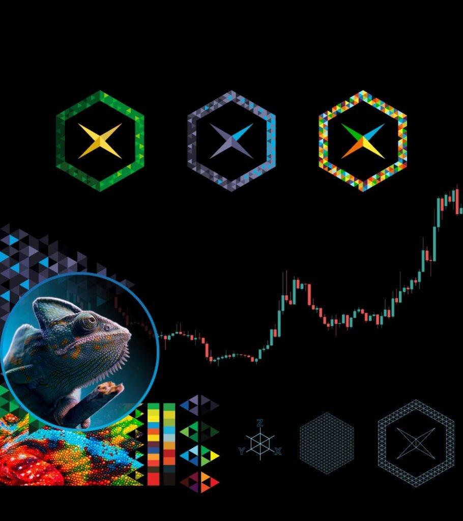
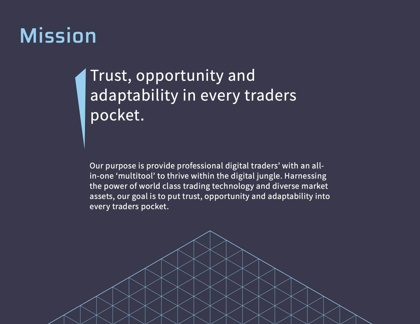
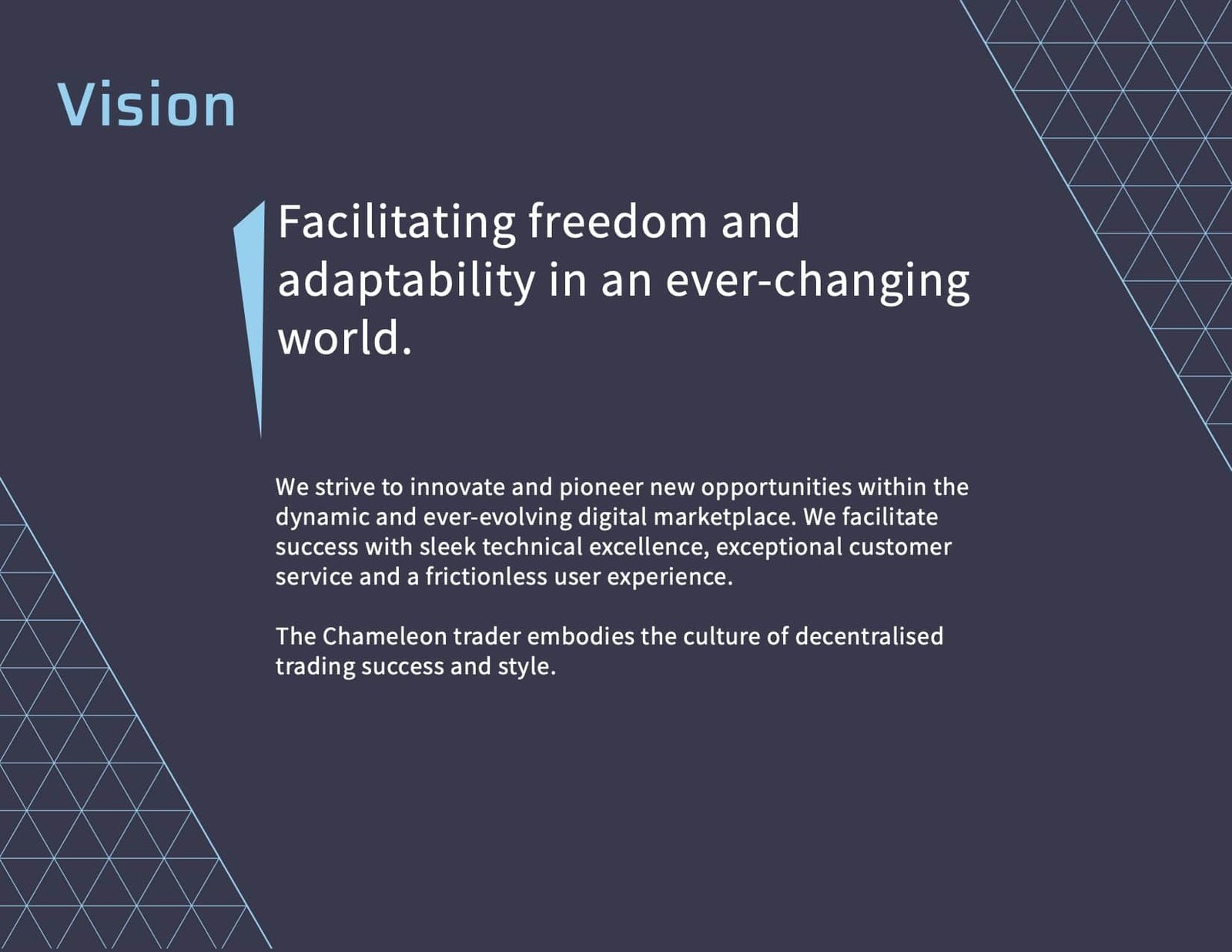
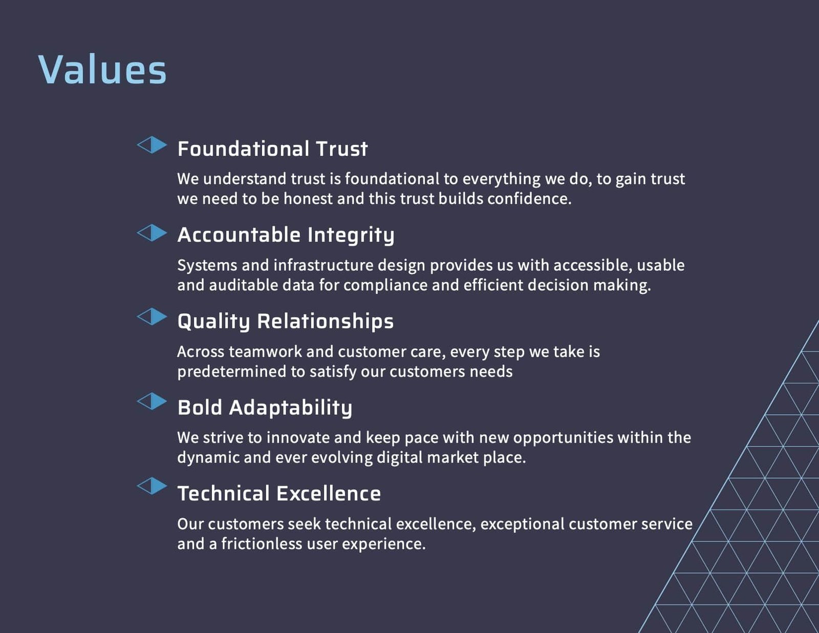
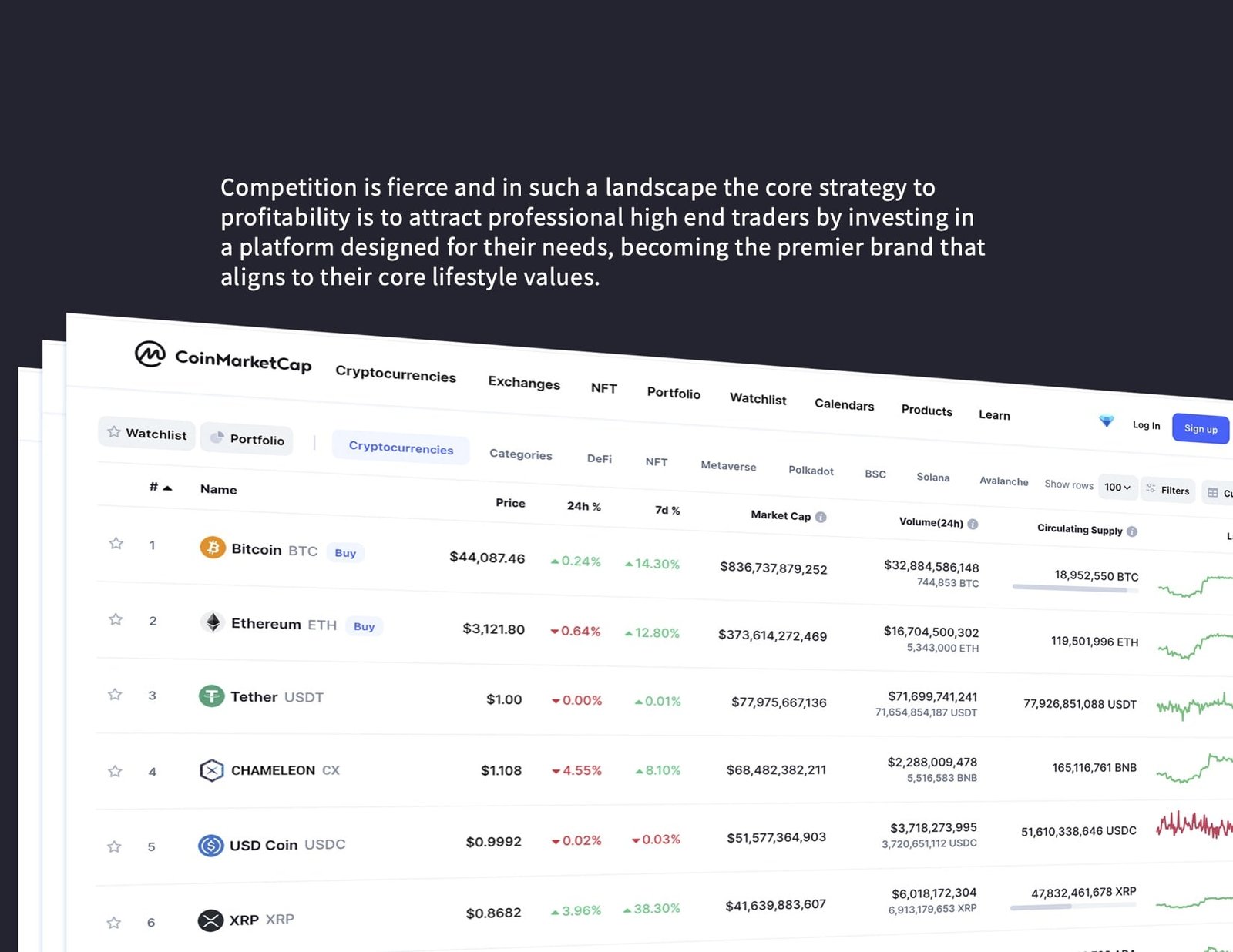
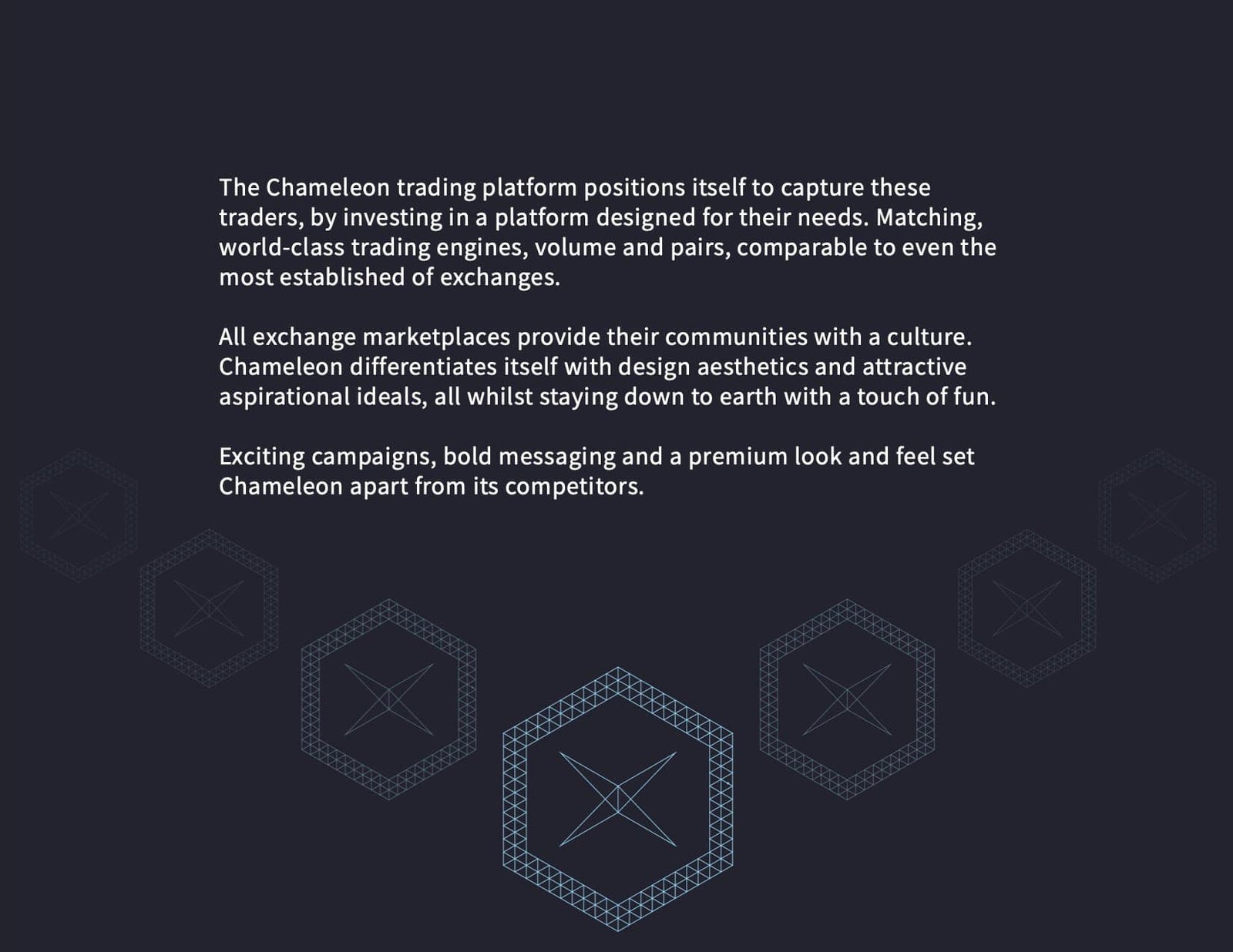
CHAMELEON is a cryptocurrency token and exchange platform. Its goal is to be a fast, compliant and versatile service for experienced traders. A unique feature of the project was having an easy on ramp for Ethereum Classic tokens.
Remote Role
Brand Designer, project consultant, product mockups and web development.
Brief
Customer research and development of Branding and a design language system to support the ICO presentation for first round of public investment.
Tech
Illustrator, Photoshop, Notion, Indesign, WordPress.

Details
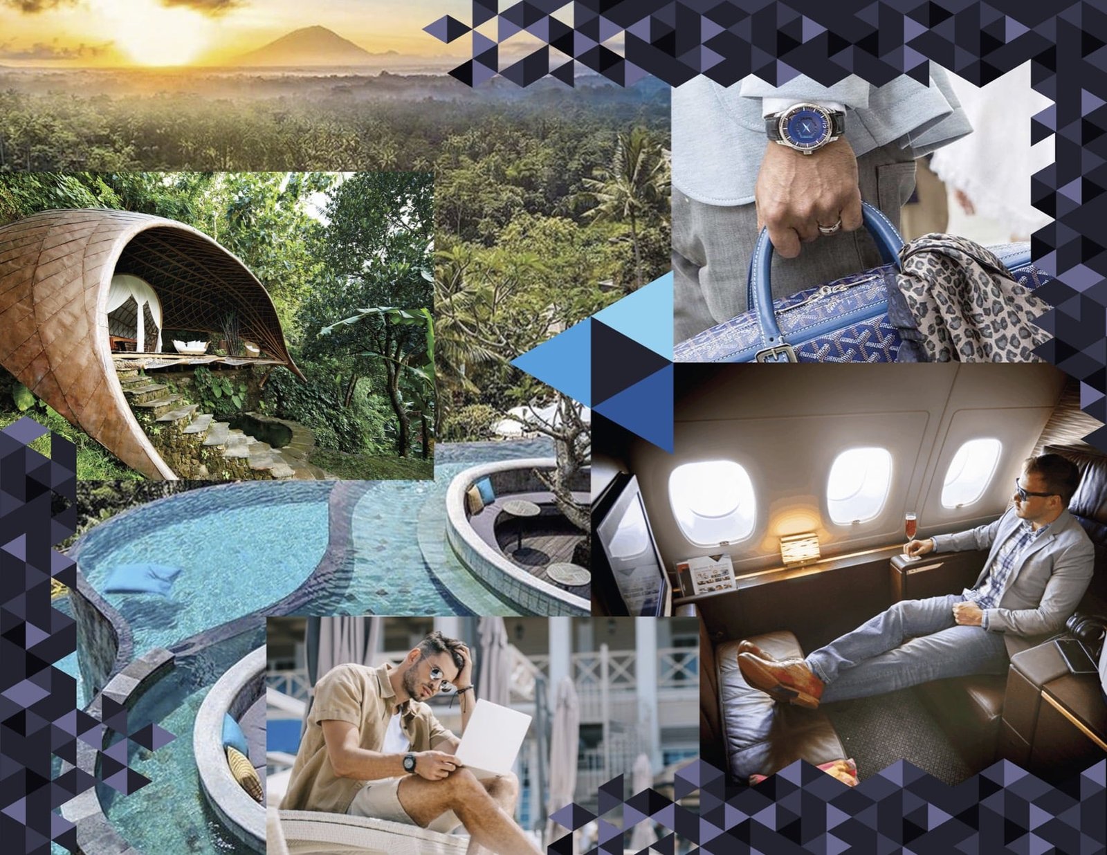
When entering a highly competitive market, it is imperative to have an brand that can have a profound impact with your desired customers. Extensive research into competitor and customer profiles, defining the Ideal Customer and key needs informed the preliminary marketing strategy and the brand story telling that permeated the whole project.
Using the Coception Studio Framework, a comprehensive design language was created with an adaptable visual style to match the brand identity and mapping customer pathways and preliminary UX/UI prototypes were made for the creation of a full cryptocurrency trading platform.
With this foundation an ICO presentation for the project was created as a wordpress site accompanied by a white paper pdf documentation.
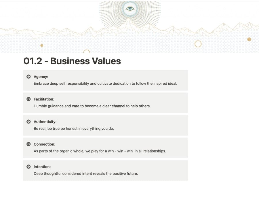
When developing the higher level business identity, Stakeholder and community input was critical. Questionnaires were sent out, feedback collated and this researched informed the high level brand narratives, such as values, mission and vision.
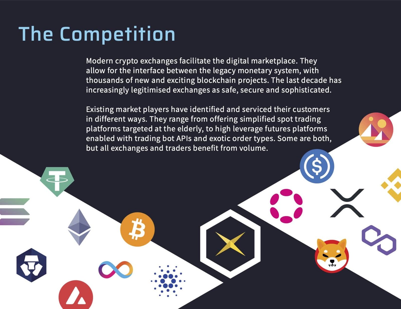

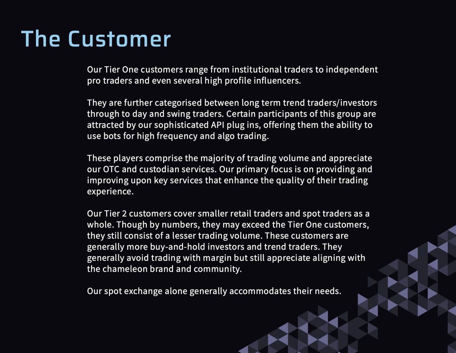

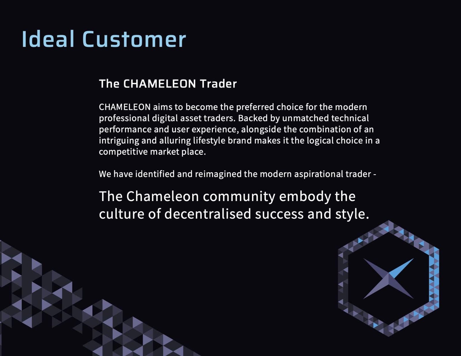
Comprehensive market research with customer analysis and personas and empathy maps, along with competitor analysis was conducted before the deeper branding process was engaged.
A detailed Brand document was created in traditional static pdf format and also a living Design Language system in Notion using the Coception Studio Framework. This framework can develop as the customer journey becomes more refined as the business grows to adapt to the marketplace.


Reflection
Startups are vulnerable to market forces as they seek the balance between investor confidence and early customer traction. A well thought out design language can support a business venture to have confidence to be adaptable to these forces. A solid toolbox of story telling tools gives the business the space to navigate the changes required to meet this balance of investor / customer relationships.
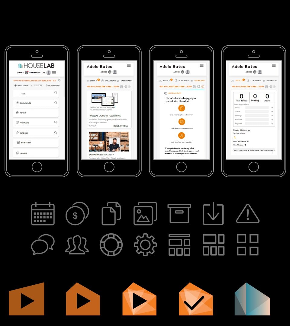
Houselab Nov 2018 – Jan 2019
Project
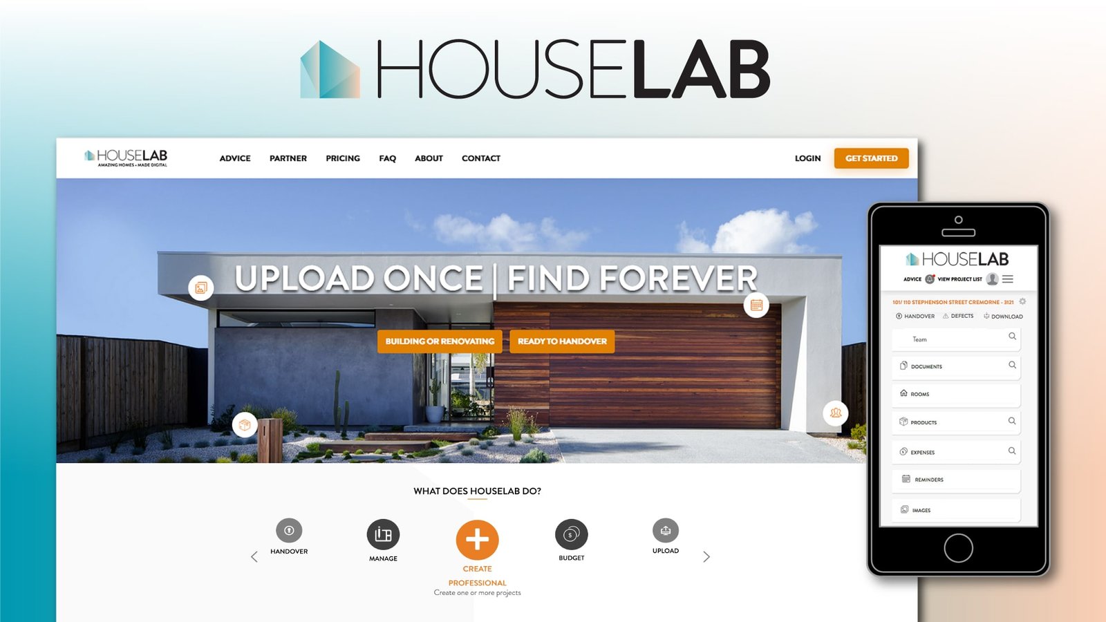
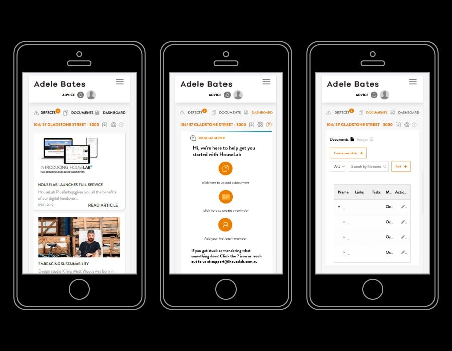
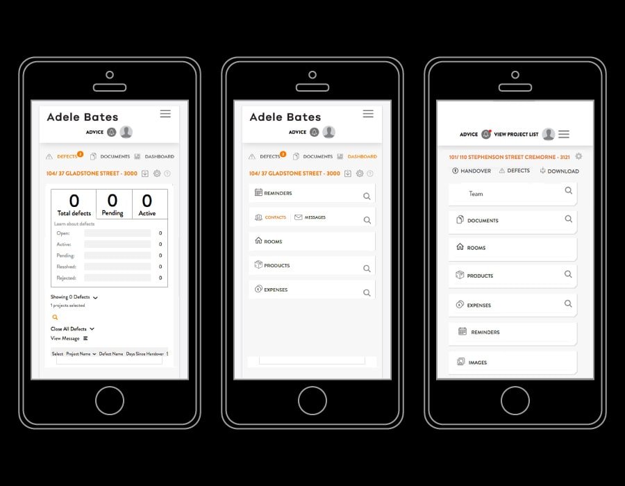
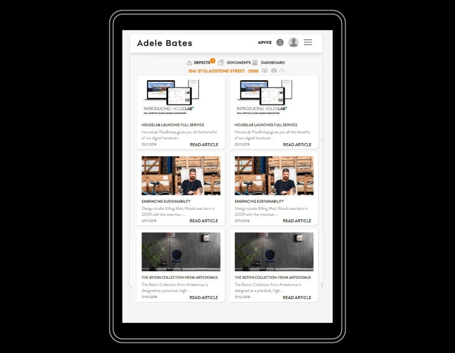
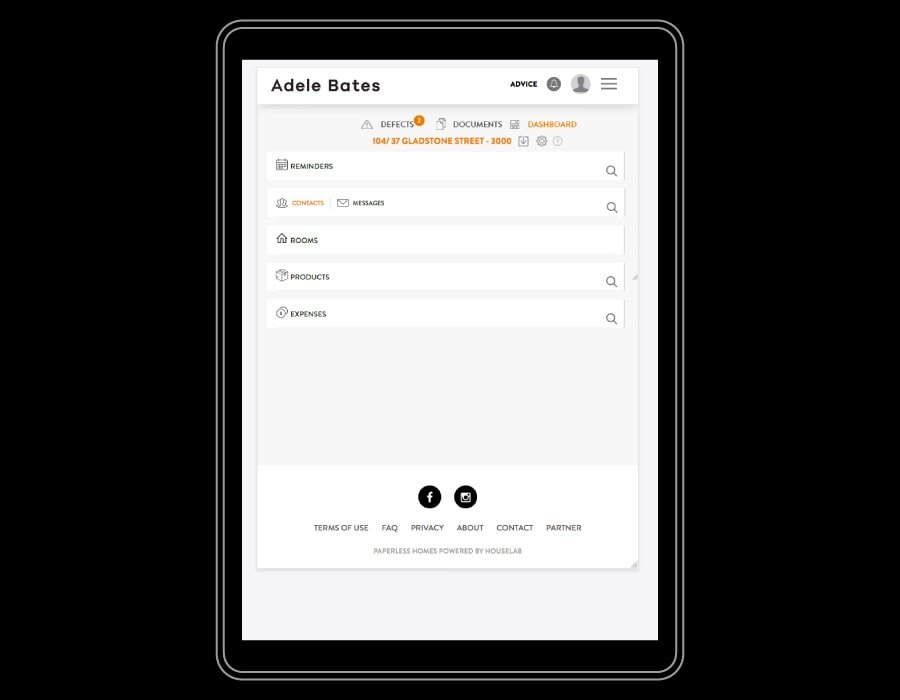
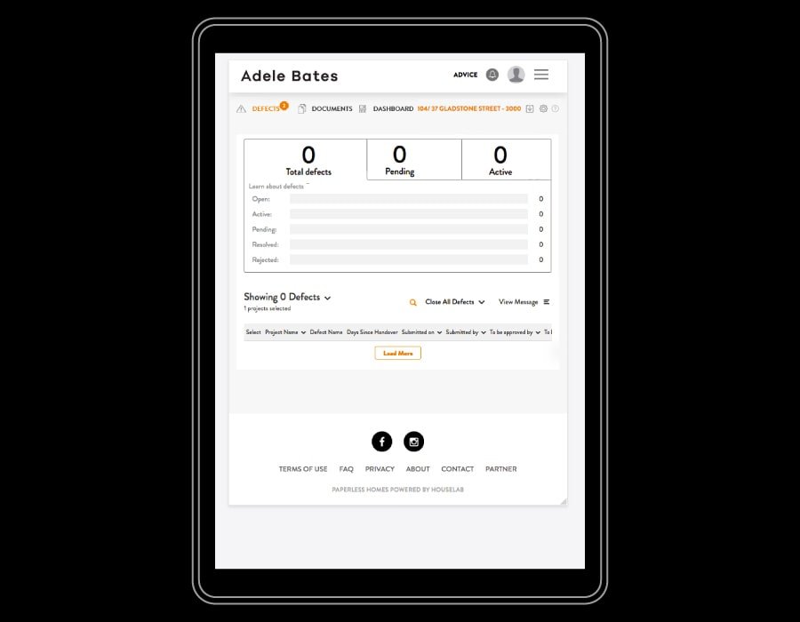
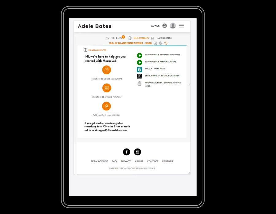
Houselab is a saas platform that assists Architects, Builders and Home Renovators with project handover, managing defects and repairs, with a digital document storage for warranties, manuals, budgets and documentation of the build.
Remote Role
UX Designer, and Project Consultant.
Brief
Branding, UX Designs, wireframes and prototype the user experience and developer documentation for handover to offshore dev team.
Tech
XD, Illustrator, InVision, Dropbox Paper .
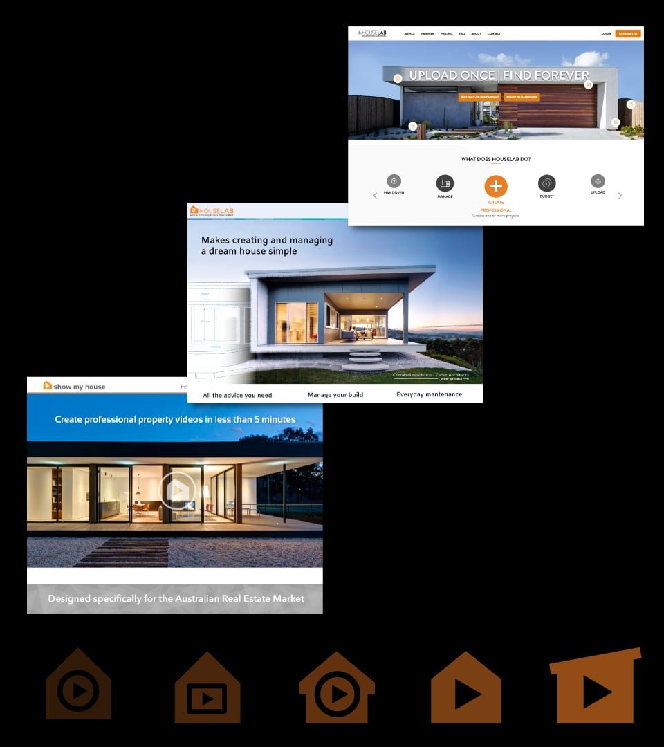
Details
The project started as “Show my house” with designing the initial brand concept and prototype for a virtual tour of a house aimed at the realestate market. After further market research and feedback from networking in the industry the product pivoted and refined it’s focus to support the handover process of property sales.
After rebranding as “Houselab”, this new direction went through a scoping process outlining new features within the existing product. UX cycles were coordinated with the founder to work within budget constraint. These cycles were staged after each development milestone was achieved by off shore development team.
The main challenge was to streamline the user experience to simplify the complexity of managing assets of multiple properties across multiple projects. This was solved by created repeatable UI components that allowed the presentation and manipulation of information in an easy to understand fashion.
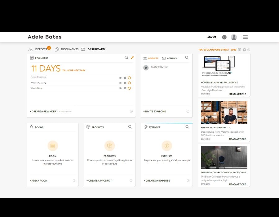

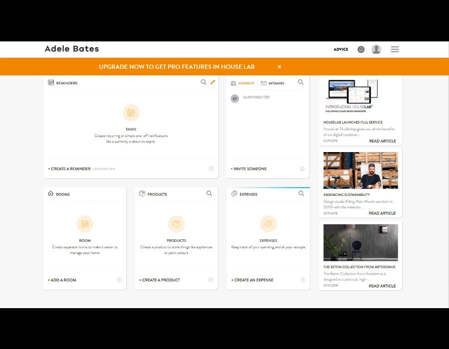

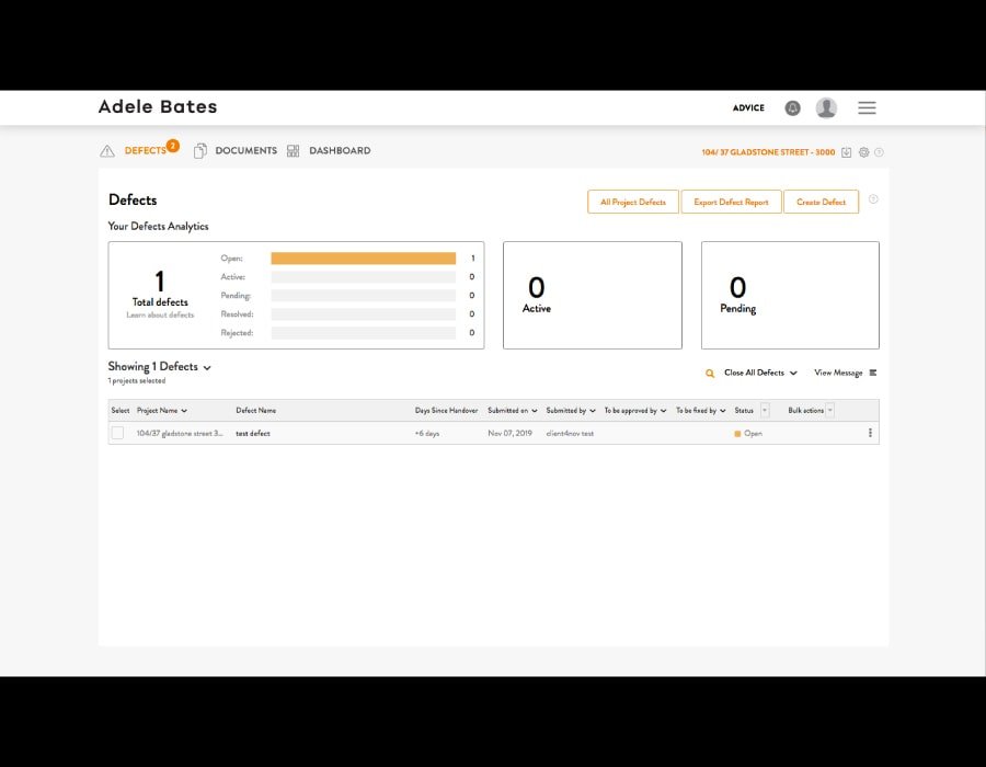
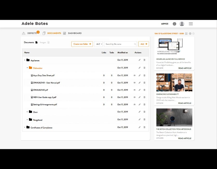
Over UX interations UI components were designed to be re-used in the various part of the systems hierarchy. This formed the foundation of a design language system that the Dev teams could problem solve with in their iterations of the product development.
Targeted mobile and tablet screens were designed alongside developer documentation to assist in guiding off shore teams in translating the main web interface into their mobile counterparts.


Reflection
Offshore development can be tricky. Communication challenges and a”work it out as you go” methodologies can create a situation, where the budget can spiral into frustration trying to deliver a bug free customer ready product.
Engaging a professional design team that understands of the limitations of technology to work closely with the C-Suite and key stakeholders can help mitigate these problems. Having clear UX/UI documentation at the start of each cycle needs to followed up by a review process for each major product milestone that involves this design team.
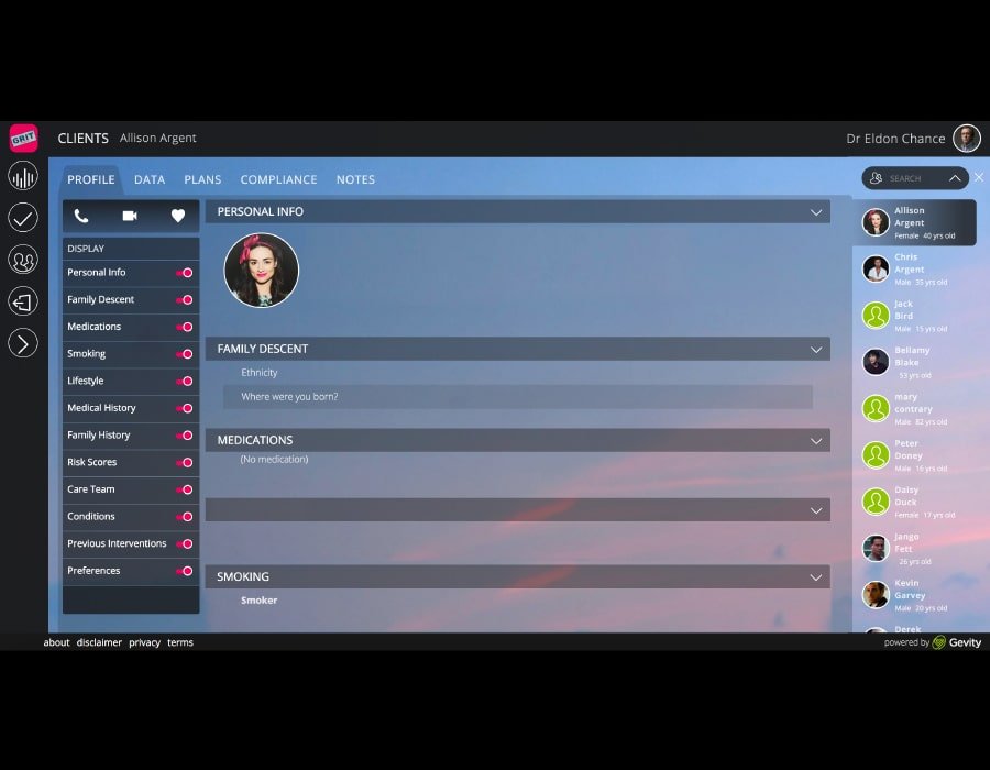
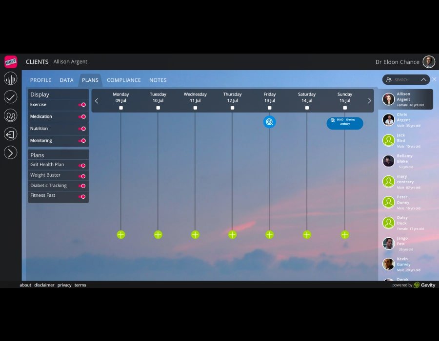
Gevity Nov 2016 – Aug 2018
Project
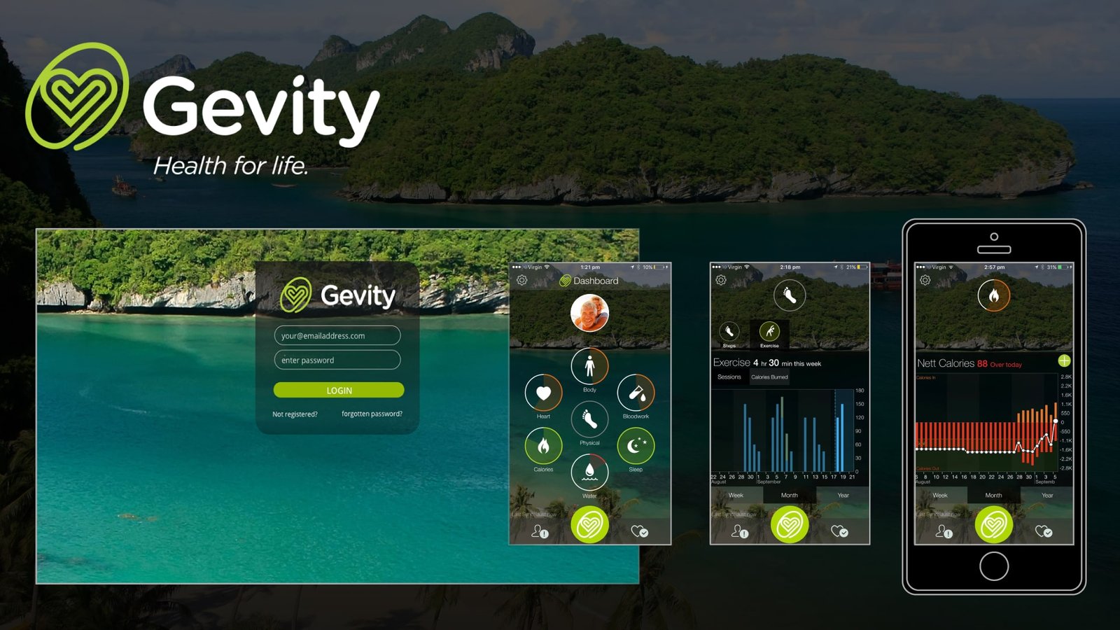
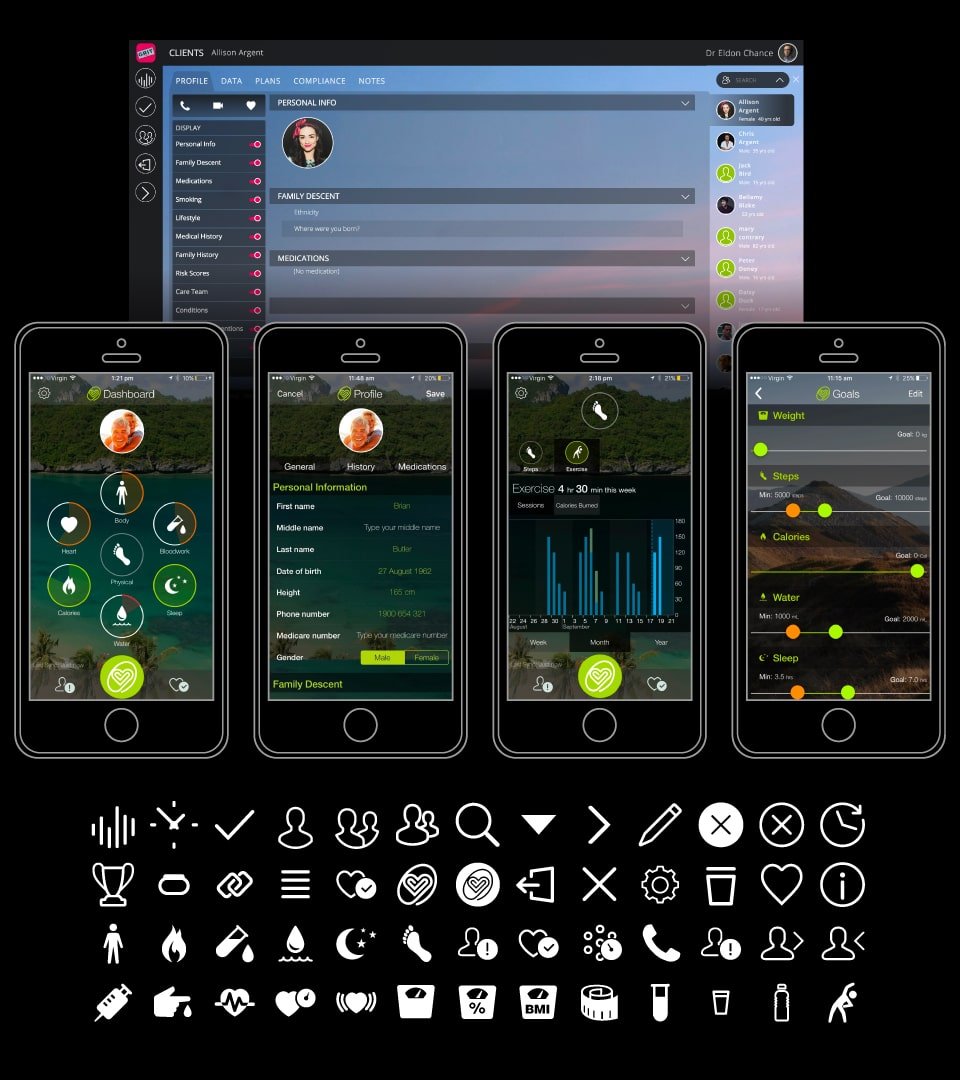
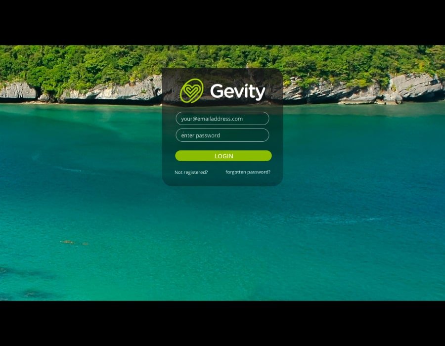
Gevity is a health monitoring service that connects and collates user health data from health plan activity and IOT devices with Health practitioners to monitor and manage their health.
Studio Role
Project Lead , Senior UX Designer and Frontend Dev in a team of 9.
Brief
To design and project manage the development of a web based health portal integrating camunda workflow engine and re-develop an existing iOS app as cross platform mobile solution.
Tech
XD, Illustrator, UXPin, GIT, Sass, HTML, javascript, LAMP Stack, custom model driven MVP Framework, Cordova, iOS and Android. Jira and Confluence.
Details
Extensive UX designs and wireframes were made for the Gevity health web portal. An advanced prototype was developed to create an adaptable User Interface and design language. This design system stood the test of the agile development process, giving an UI palette to the development team to respond to product changes.
As Team Lead apart from UX , UI design and development I was also responsible for client management, sprint planning and daily scrum.
A key achievement of this project was the development of a solution to switch the branding and UI for white labeling versions of the platform. Using Sass and Javascript variables a codebase developed to change the look of the whole platform with a single line statement.
A detailed prototype was made using UXPIN to explore a UI interface theme that could allow for full photo backgrounds. A frosted glass theme was developed with layered components to allow these customisable images the user.

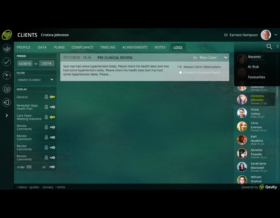

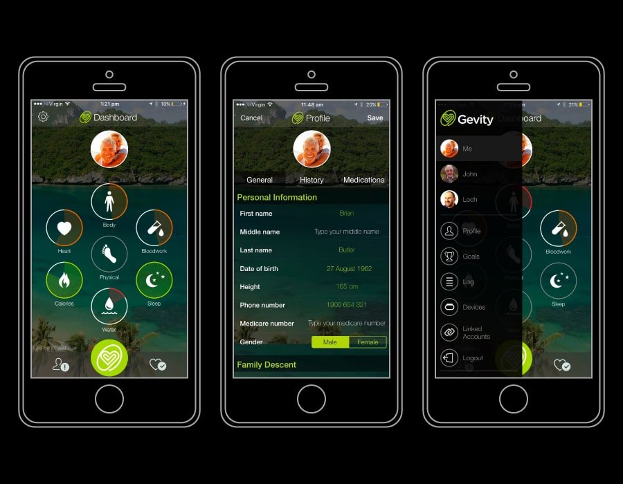
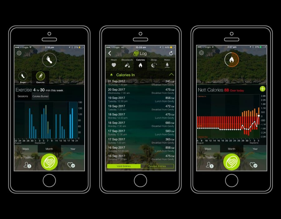

Pixel perfect prototypes were developed into fully released mobile apps for iOS and android platforms. Data rich interfaces to show the user progress of complex health data were achieved by custom css tweaks over a javascipt charts library.
Reflection
This project demanded a rich interface to show the complexity of the customers detailed health data. Having the foundation of a solid design language system allows the creation of custom UI components that can work well together.
Giving the team space and time to create thoughtful written code can also have longterm benefits of a product that can be adaptable to live changes to suit market forces.
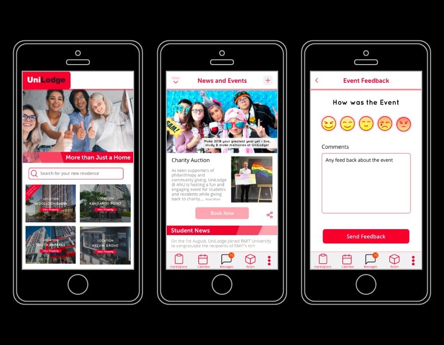
Unilodge Dec 2017 – Aug 2018
Project
Unilodge Student Services app is a communication and property management platform for student accommodation across Australia and New Zealand.
Studio Role
Project Lead , Senior UX Designer and Frontend Dev in a team of 9.
Brief
Design and develop a student services app and property management platform to streamline and replaced existing property management processes required between residents and property managers, while supporting the communication the networking of community spirit programs and resident care requirements.
Tech
XD, Illustrator, GIT, Sass, HTML, javascript, LAMP Stack using custom model driven MVP Framework, Cordova, iOS and Android. Jira and Confluence
Details
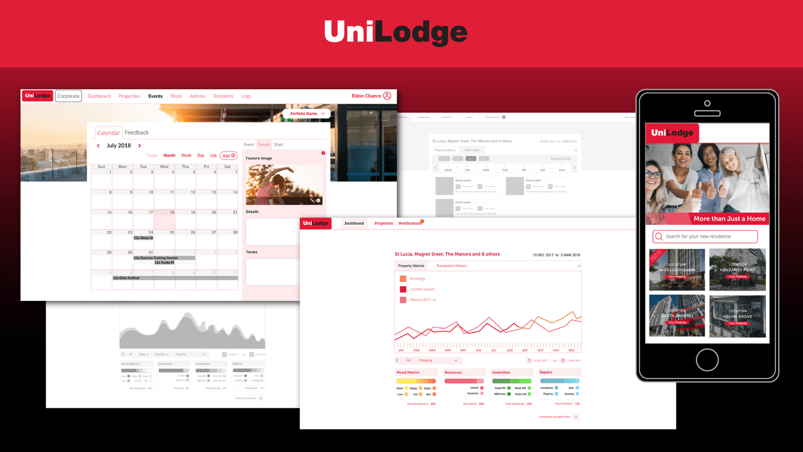
Leading a team of 6, comprehensive UX scoping and wireframes outlining the project requirements revealed a key product breakpoint was the low user engagement in the core user stories required to replace the existing property management processes.
Further UX research developed a strategy to create a marketplace channel of student offers and discounts, event promotion and a booking engine. Leveraging the value of the Unilodge customer base of student residents in Australian major cities to form strategic partnerships with companies that wish to target the student demographic.
The content and features of the channel would be developed in response to in app user feedback. The Marketplace would be then gradually accented by legal and residential processes required by unilodge customers, that replace the existing property management process.
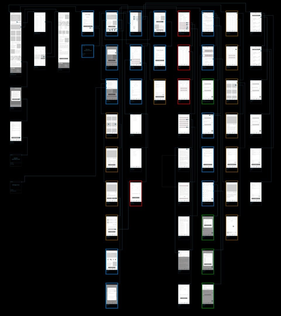
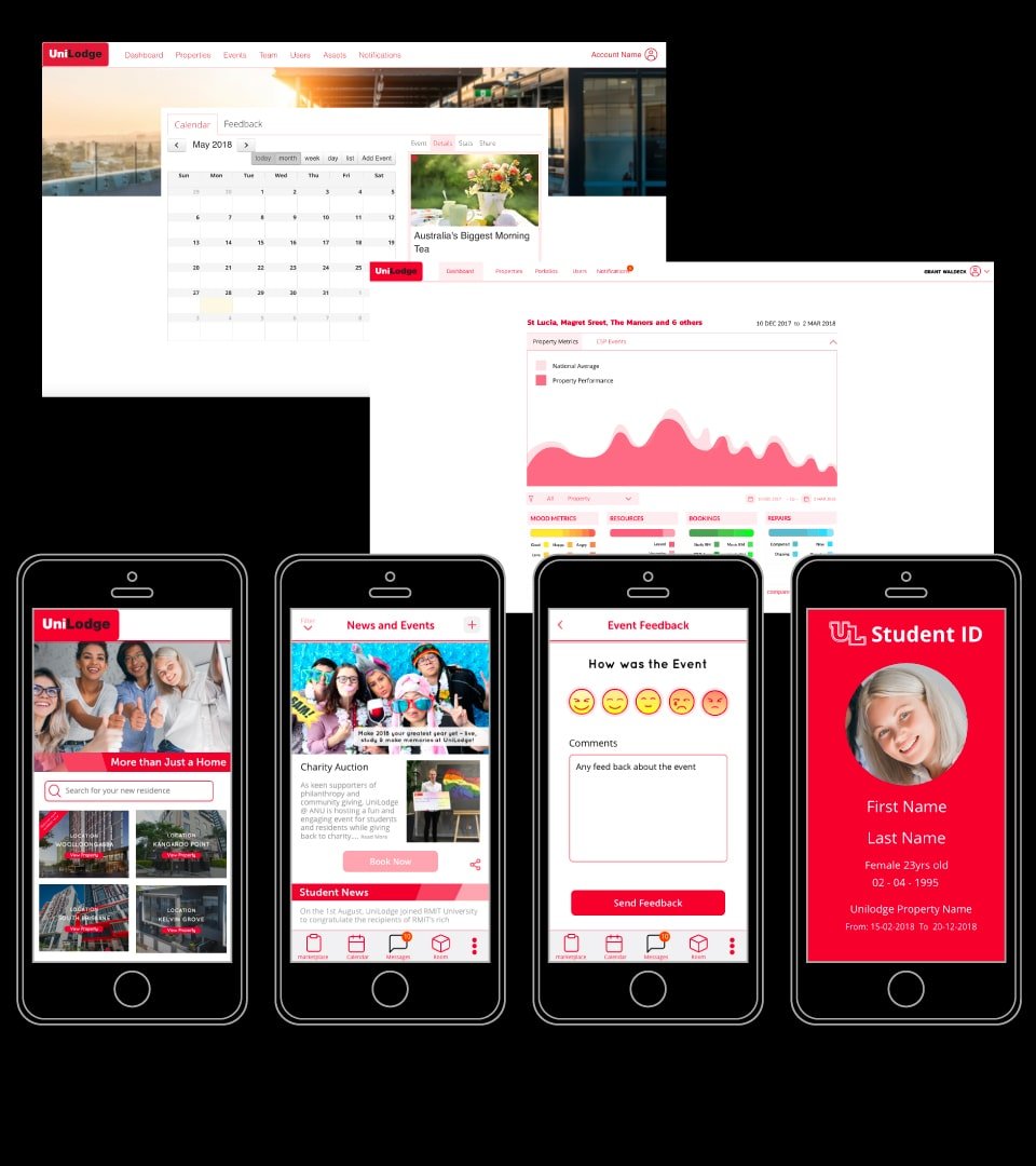
Comprehensive wireframes were created for a Student App, and Property Manger/ Corporate Portals. These were designed to mapped to project milestones and sprint development cycles.
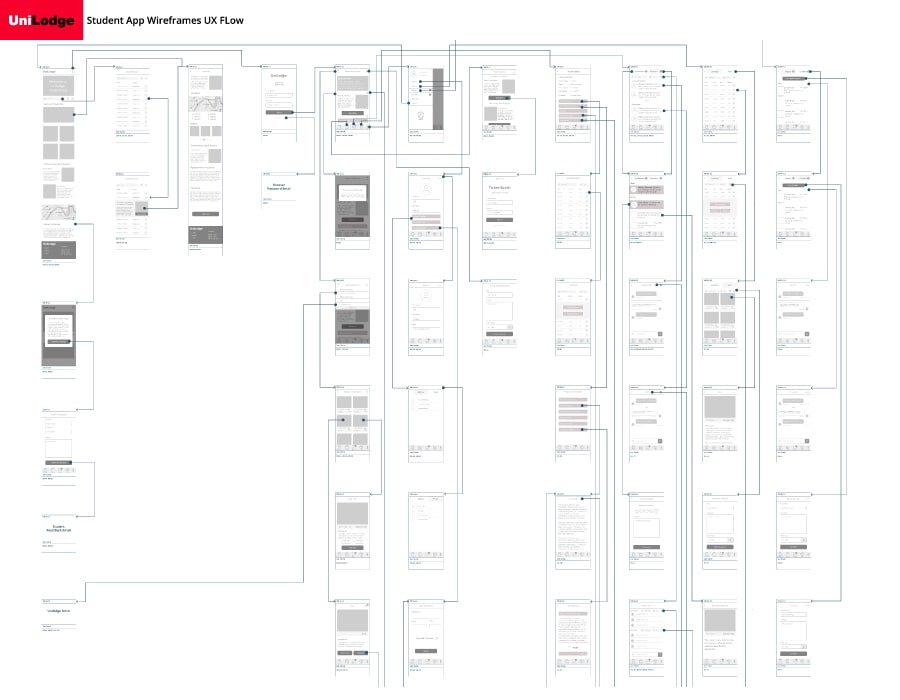
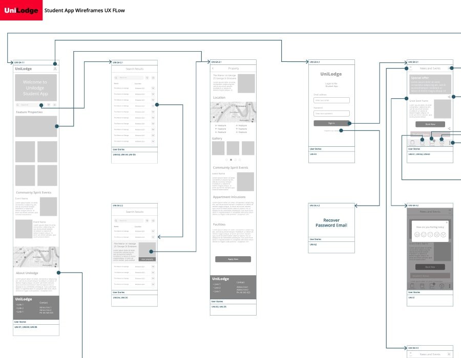


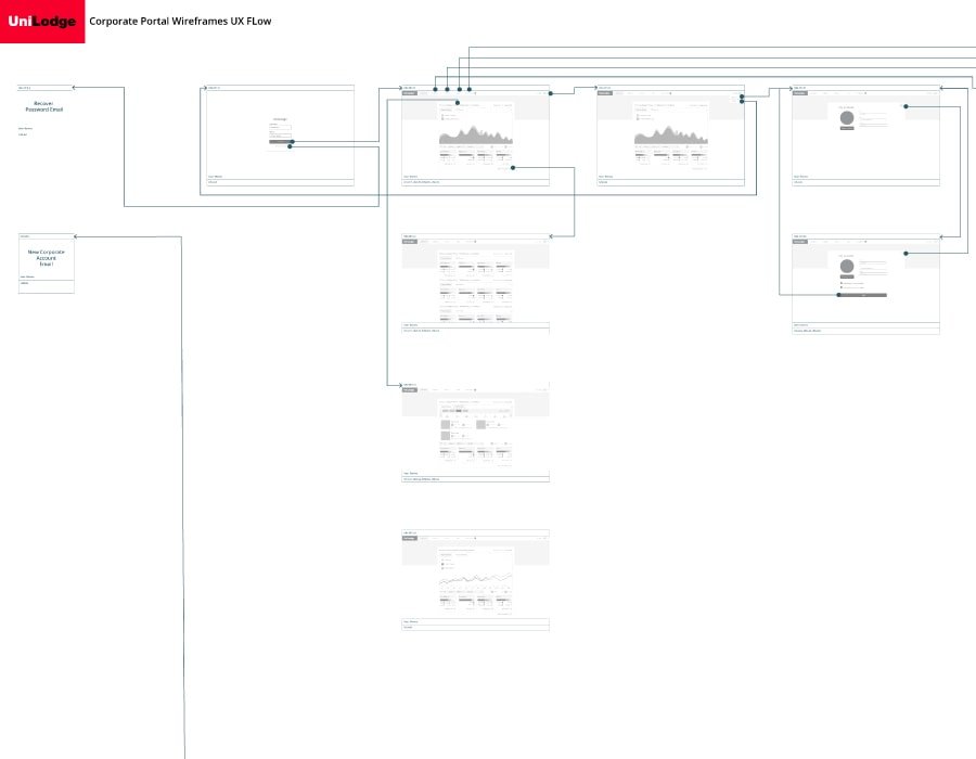


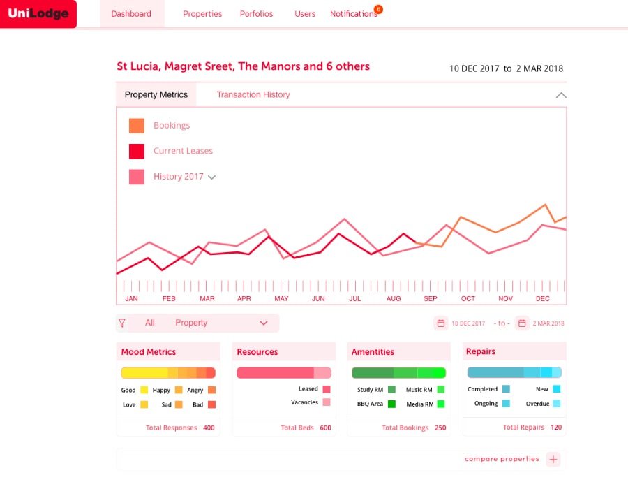
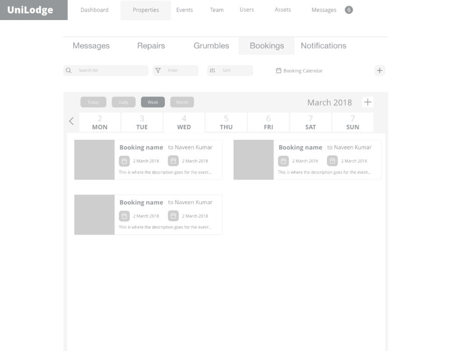

Lo-Fi proof of concept prototypes were designed in adobe XD and targeted Hi-Fi screens were created based upon corporate branding for key stakeholder approval and guidelines for translation into a saas stylesheet and UI components.
Reflection
When designing a service that requires behavioral change, it is of fundamental importance to have a compelling reason to inspire customer engagement. Without this, the return on investment for designing and developing a complex system becomes questionable.
Thoughtful planning can find the sweet spot between the stakeholder’s desired outcomes and meeting the customers inspiration to adopt new behaviors.
Implementing strategic development cycles that gradually release new product features in sync with the level of customer engagement can quantify the investment as the desired results are achieved.
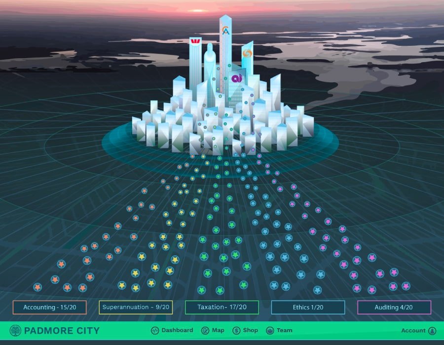
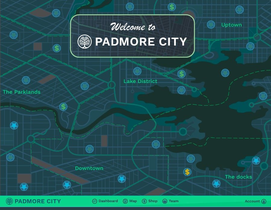
Padmore City Jun 2017 – Sept 2017

Process
Padmore City is an educational game platform to enhance the professional development for the chartered accountants workforce.
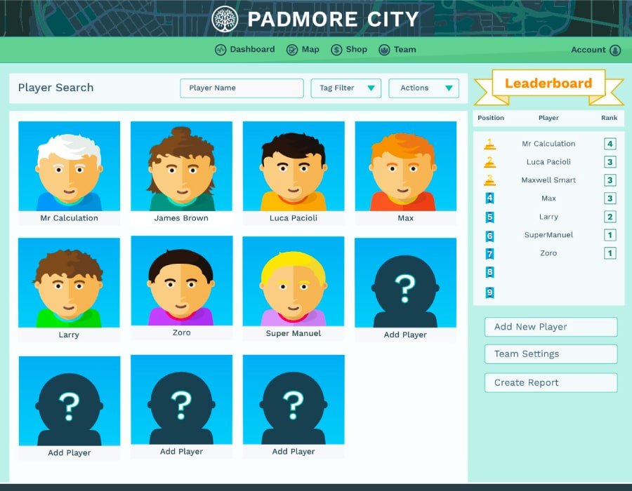
Studio Role
Project Lead for a team of 3, Senior UX Designer and Frontend Dev
Brief
The project brief was to deliver a proof of concept prototype including a chat bot and interactive game workflow. Working with set educational content to create a gameflow engine for accounting professional development and an expandable SaaS Platform to other educational modalities.
Tech
XD, Illustrator, GIT, Less, HTML, javascript, LAMP Stack using custom model driven MVP Framework, Chat Bot, Jira and Confluence.
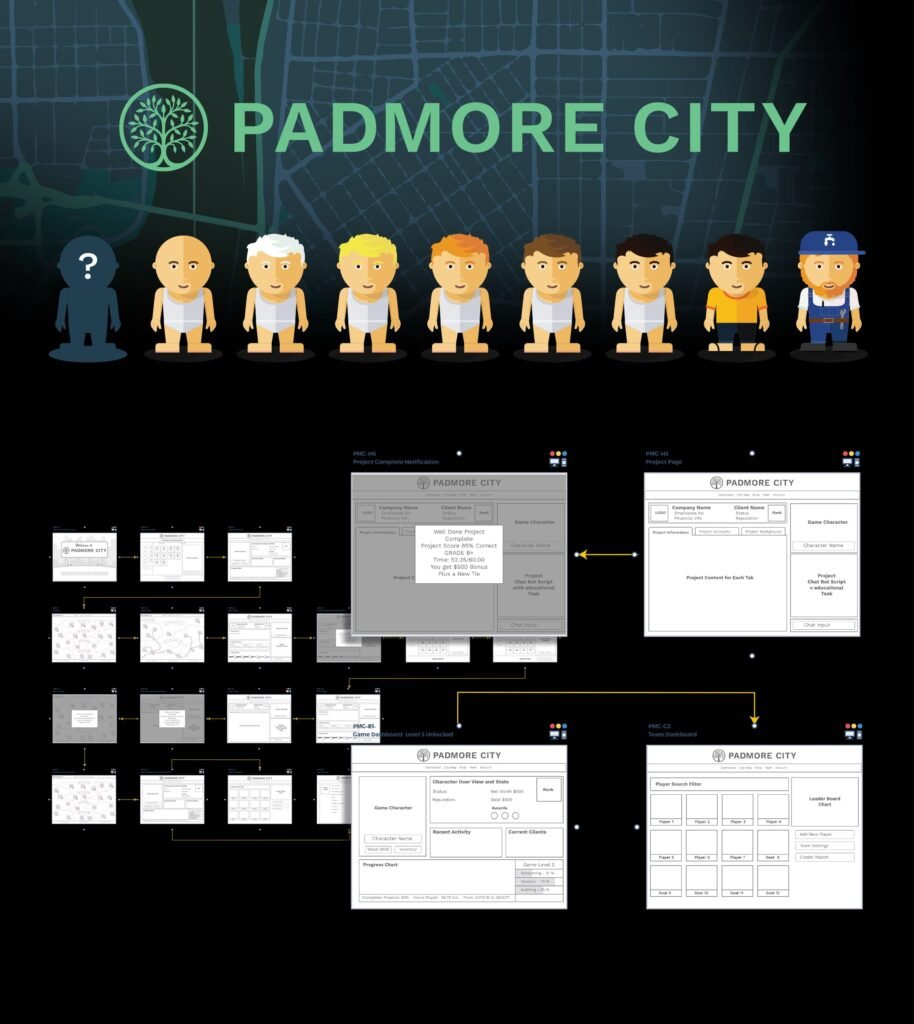

Details
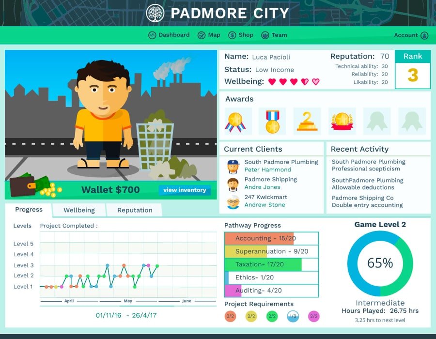
In depth UX research and analysis was required to model the educational content for gamification, creating an educational gameflow engine.
Learning tasks were then structured into narratives to be communicated in a chat bot technology, allowing varied user responses and game awards to the educational content.
Wireframes and Informational Architecture models were then created to story board the user journey for a proof of concept prototype.
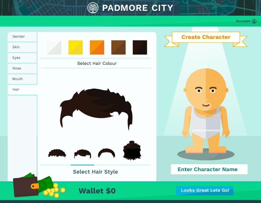
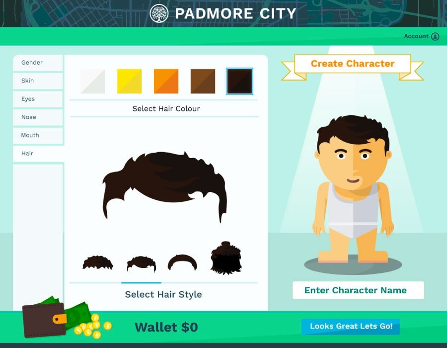
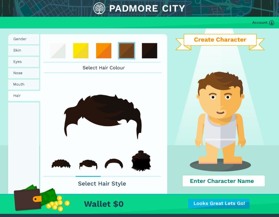
Character designs were the developed to interact within scenes that where access by a game map based on a city to show the progress of the user in their learning pathways.
A simple html image based prototpe was created for the proof of concept prototype. Interactive Hotspots layered over a full page background with image swap replacement for UI elements emulated the functionality of a full user interface.

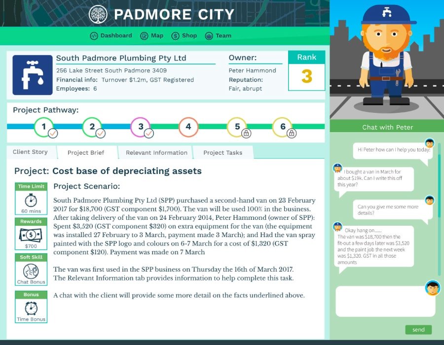

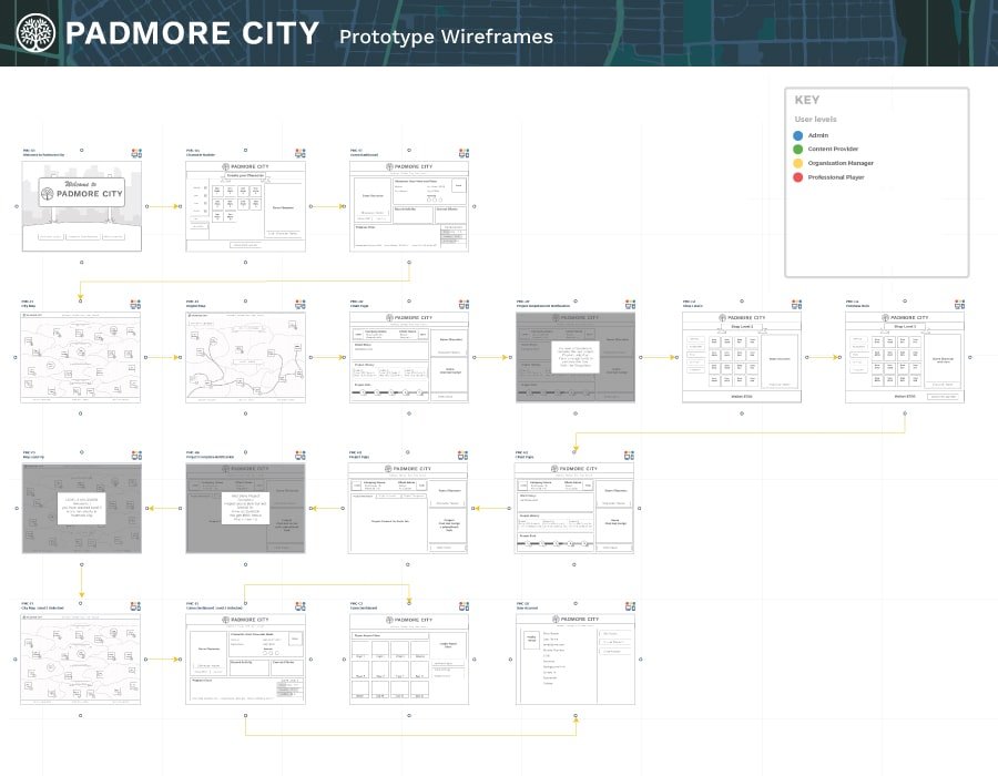


A functional chat bot was developed, with scripted pathway loops for emulating a complete gameplay. This pathway was based upon a questionnaire format to test the users retention of the educational content. An information architecture model was required to map the outcomes of the answers from interaction with the chat bot.
Character design was developed around the ability for the user to create and customise their own avatar as the game progressed. This style design in a flat graphic style that could be in harmony with the UI components of and education system while also be able to interact in the landscape of the greater world of the game play.

Reflection
This was a fun project that required the development of the background structure, logic and framework of a game theory to create an interactive prototype.
The chatbot technology was still fairly primitive in its interactivity, so the need of a convincing format was critical was in the user experience.
The importance of story telling and the visual theatrics of the reveal to reach through the UI components is paramount in delighting the user in their experience of the end product.
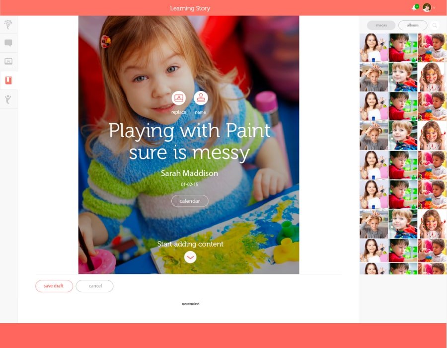
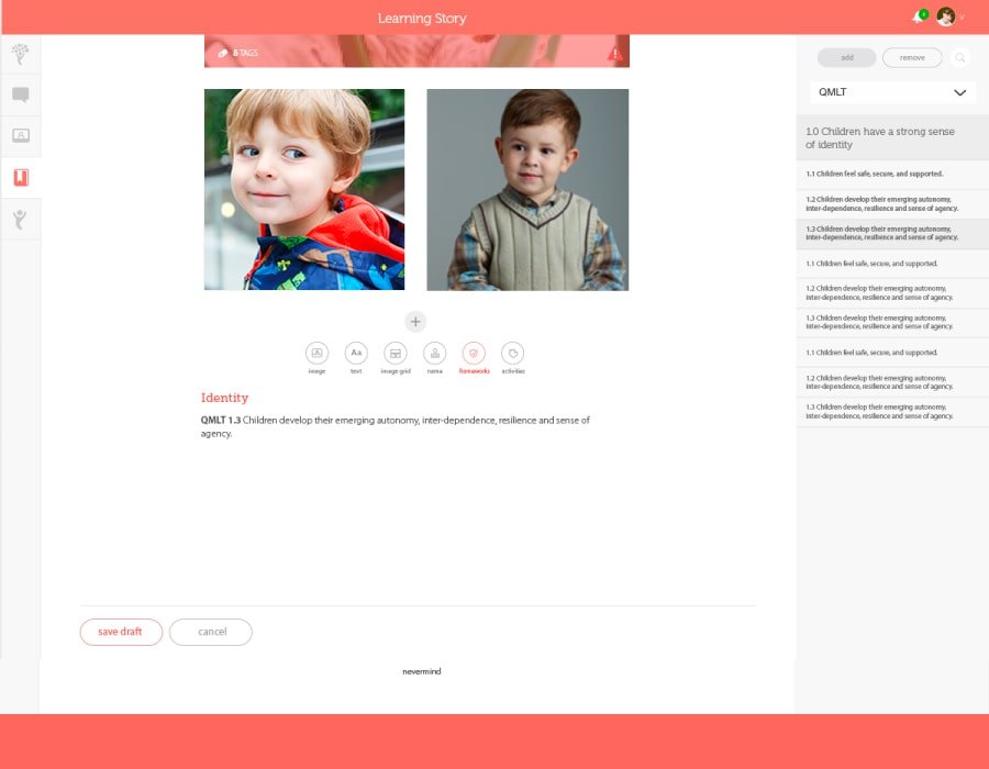
Journey TreeApril 2015 – March 2016

Process
Journey Tree is a reporting and communication platform for Early Childhood Learning Centers to connect with parents and family the activities of their child while under care.
Studio Role
Lead UI/UX designer and Frontend Developer
Brief
Create UX user stories and UI wireframes for Ipad and mobile platforms, while working with different Australian State legislation for learning requirements and family privacy laws.
Tech
InVision, Photoshop, Illustrator, Google docs, Jira, GIT, Sourcetree, Sass, NPM, terminal.


Details
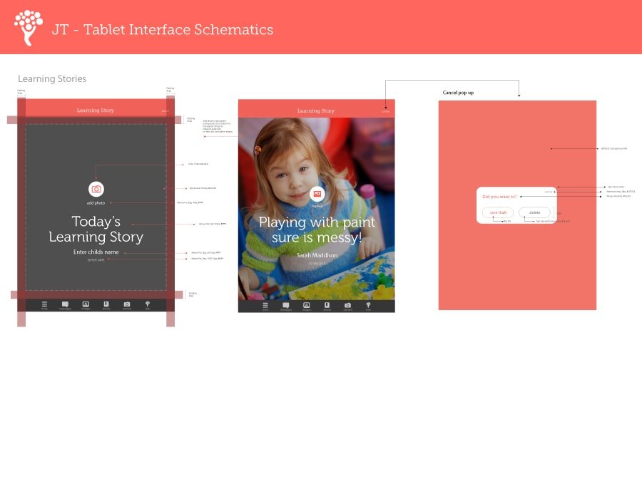
Working with a small team of designers and initial brand collateral, this project required creating InVision prototypes, style guides, user stories, UI documentation, wireframes, and screen designs to brief development team for mobile, tablet and desktop products.
The prime challenge of this product was analysing and translating the various user permission and viewpoints in a succinct UI that complied with privacy laws.
To Solve this extensive UX documentation and research was required to develop comprehensive user stories that were then correlated against screen designs and user work flows.
Comprehensive User Stories and User flows were designed and developed. This documentation was supported by style guides and interface schematics to assist developers in translating prototypes into web and mobile platforms.


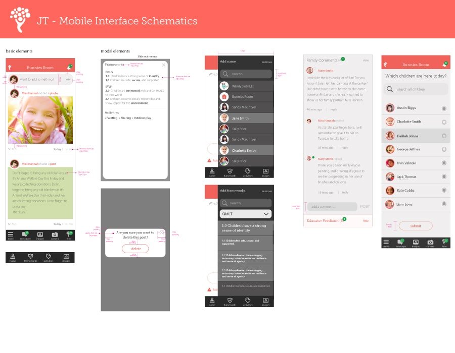
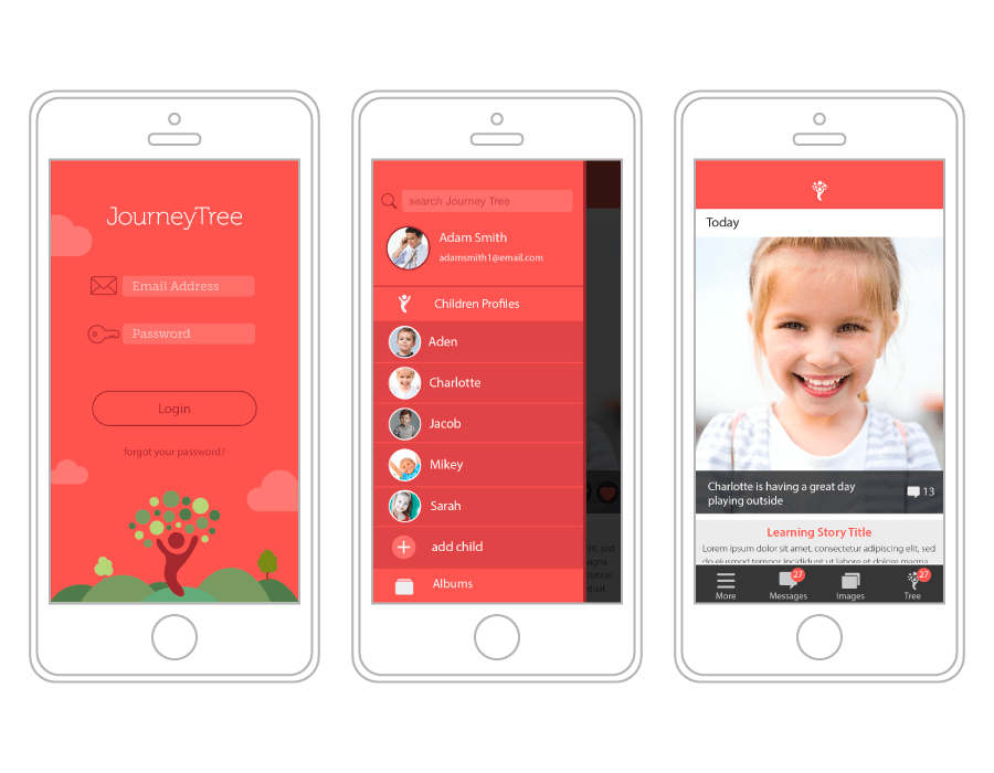
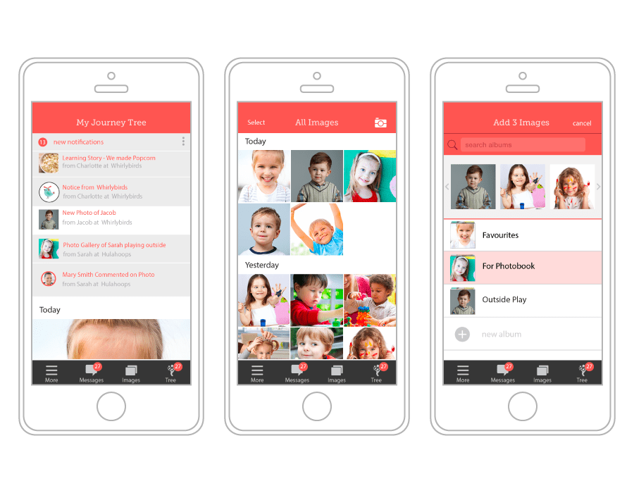
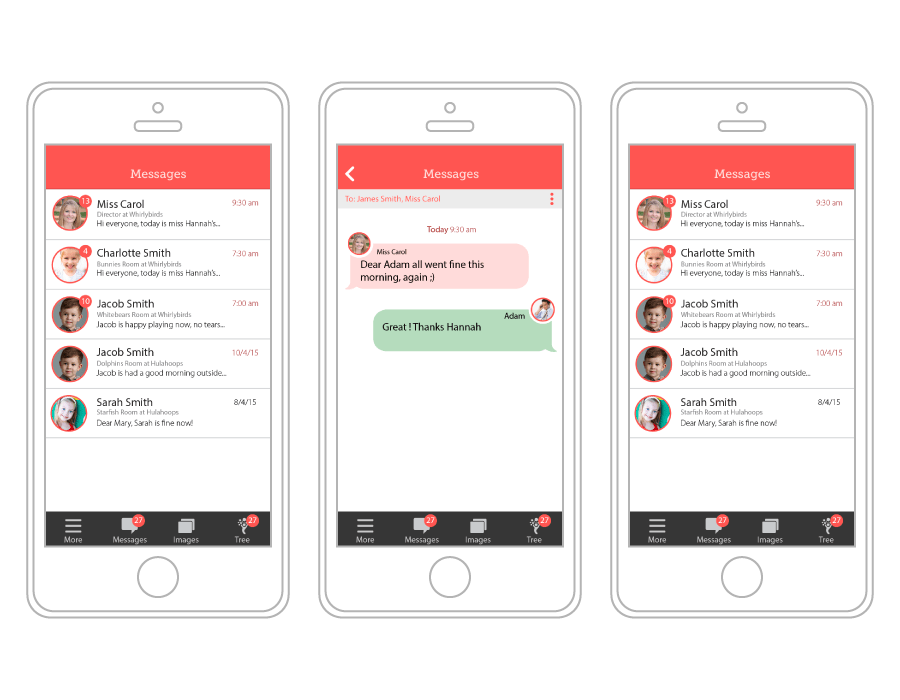
Invision was used extensively create the responsive UI components for mobile prototypes that can then be translated to web, ipad and large desktop formats.
Desktop and iPad prototypes were designed to define different account holder pages. A Story creation workflow was designed to help educators be compliant with education requirements while simultaneously being attractive to parents and family.


Reflection
When dealing with a complex system, defining user types and user stories is important in being able to design a robust user interface. This to be supported by a process that adapts to these various end use cases that arise as the project develops and hones itself for the marketplace.
Prototyping is important in problem solving, initial testing, stakeholder approval and investor confidence but is imperative to get a project into a live codebase. Having solid UI components and a css style sheet, can then handle dynamic changes in project development with immediate results.
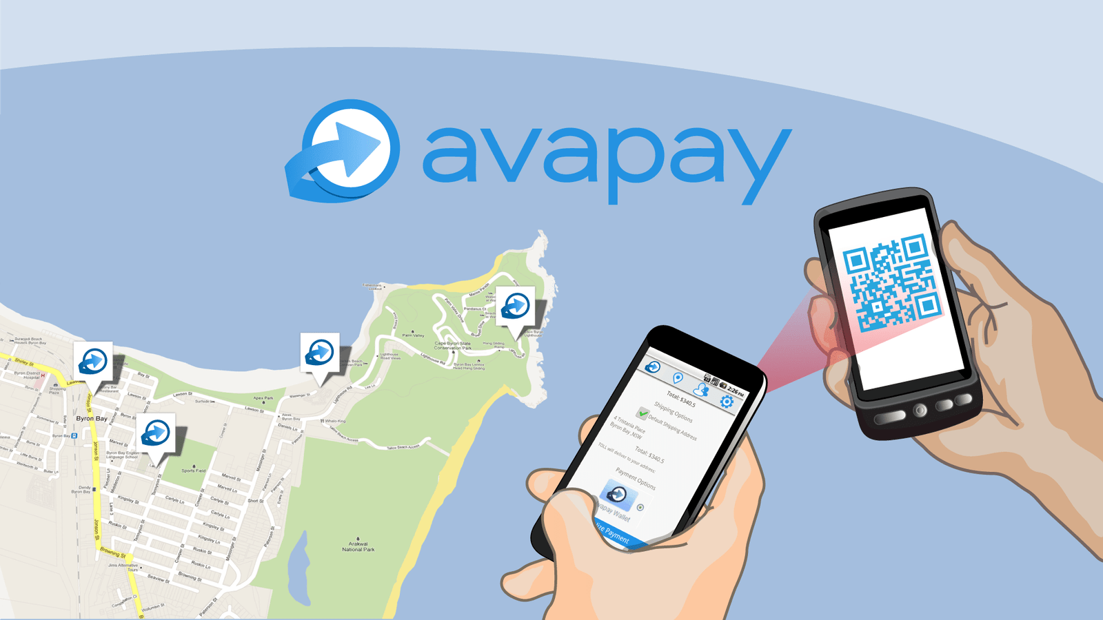
Avapay Nov 2010 – Oct 2012
Project
Avapay is an Australian based mobile payment system targeted for small businesses, solving point of sales with mobile devices with an inventory management system.
Remote Role
Lead Designer and Frontend Dev in a team of 2
Brief
Branding, UX design and Frontend development for responsive web service and mobile apps, system analysis, pitch presentation, patents diagrams and documentation.
Tech
HTML, CSS, Ajax, PHP, Java, MSQL, AWS, Eclipse.
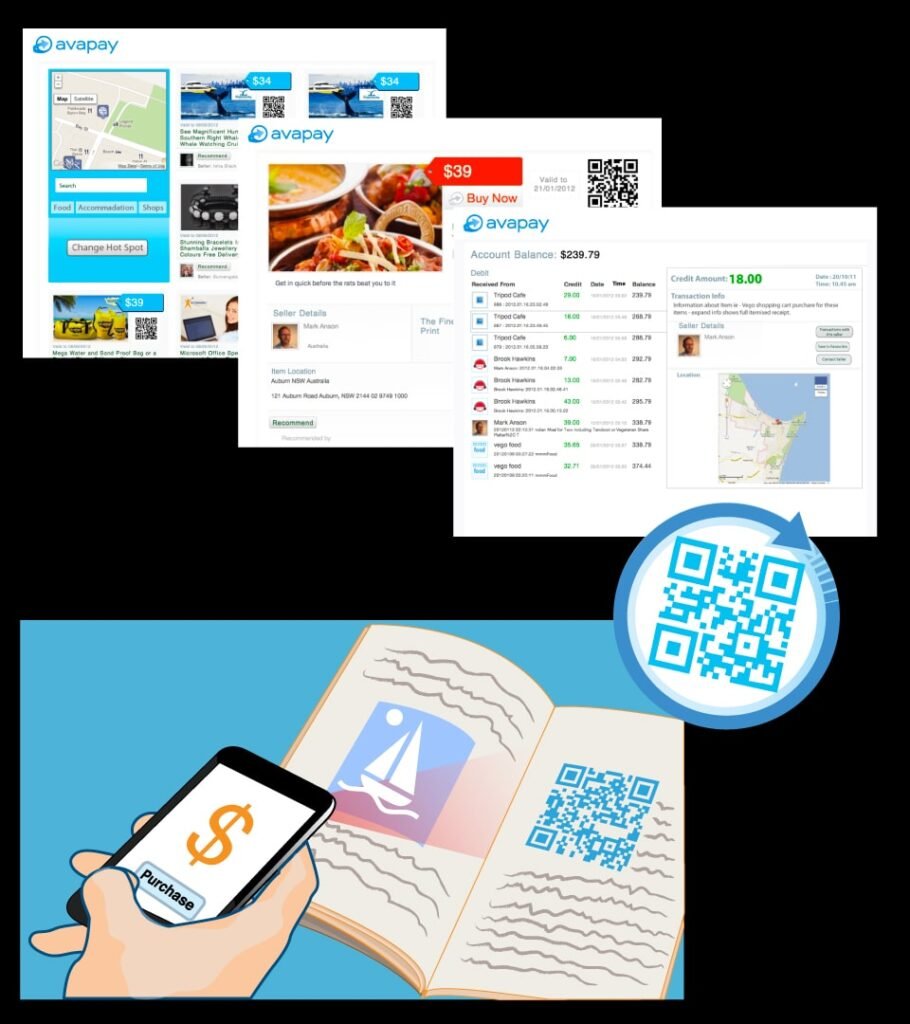

Details
Avapay started as communication and messaging platform for Google Wave that then pivoted into a mobile payment system. Working closely with the founder and lead developer, deep brainstorming and product research inspired a QR code based payment solution.
This payment solution used QR codes for device to device transactions that utilised geo location based for proof of purchase recording
Patent documentation was created and the patent was granted for this solution .
The product was further developed into an commerce ecosystem with a web responsive shopping cart built upon a inventory management system.
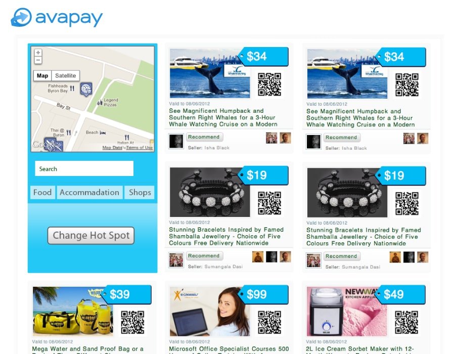
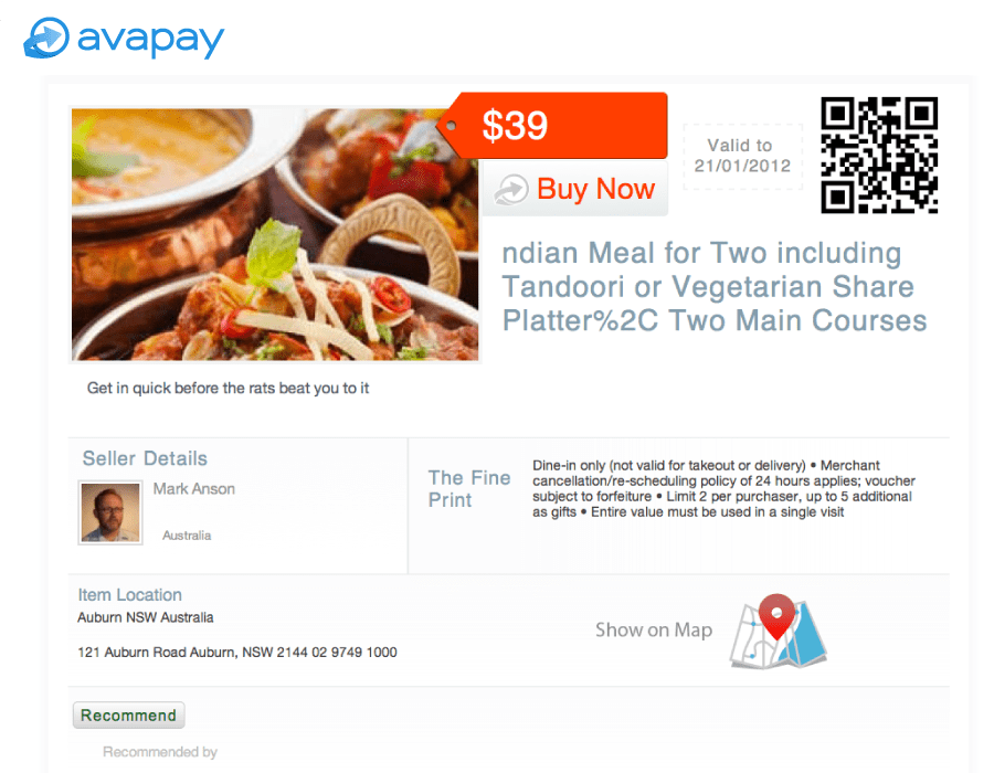
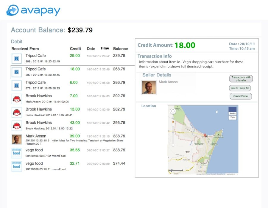
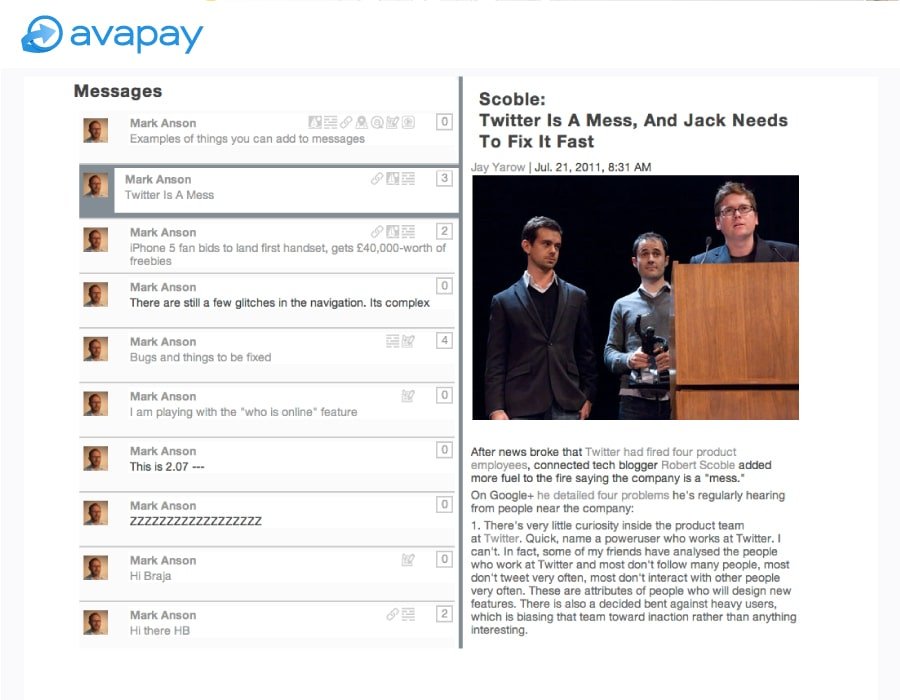
Using Java and a custom html/css frontend, a web based service was developed with location based deals. Customers could used a messaging system to communicate to business owners and other users. Each account was designed with a personal “avapay wallet” with transaction history and detailed transaction receipts.
Offshore mobile developers were engaged in the translation of the web platform into a mobile apps for android and iOS ecoystems. Mockup screens, Icons and asset were created for the developers to translate into the mobile platform.
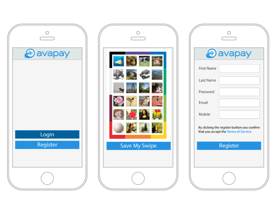


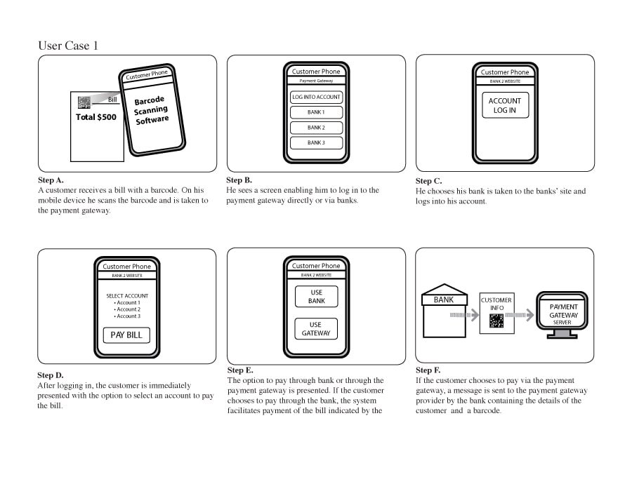

Branding, graphics and iconography was collated into web based asset library. Simple info graphics were developed for patent extensive patent documentation.
Reflection
As a designer and front-end developer working for a cutting-edge startup, my role was crucial in supporting the the company’s major pivot from a messaging service to a payment platform.
Being adaptable to respond to the C-Suite directions as a startup navigates its funding model is critical as it is challenging.
Developing foresight to market forces and protecting design innovation from corporate sabotage is important in the ideation process, as the end user of product is not necessarily the “customer” of a startup.